7 миниюня 20, 2026

Наши инструменты отслеживают миллионы рекламных кампаний в форматах native, push, pop и TikTok.
НачатьNative advertising was born from a simple, compelling insight: people hate being interrupted. As AdPushup has noted, audiences grew wise to every trick advertising executives deployed — the humor, the shock value, the emotional manipulation — giving rise to "banner blindness" where display ads were simply ignored. Native advertising was supposed to be the antidote. Its basic philosophy revolves around making ads appear less like ads, embedding brand messages within the editorial flow so seamlessly that consumers wouldn't reflexively look away. And for a while, it worked beautifully.
But somewhere between the philosophy and the execution, the industry made a catastrophic interpretive error. It confused "non-intrusive" with "invisible."
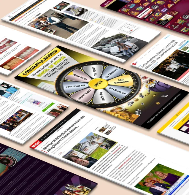
Scroll through any major publisher's content recommendation widget today — the kind that sits below an article, populated by networks like Taboola or Outbrain — and you'll notice something striking in its uniformity. Every thumbnail looks the same. Stock-photo faces angled slightly left. Vaguely curiosity-baiting headlines in identical fonts. Muted color palettes that blur together into a homogenous band of beige mediocrity. The ads don't interrupt, true. But they also don't register. They've become visual white noise, the digital equivalent of wallpaper in a dentist's waiting room. Native advertising didn't kill banner blindness. It simply bred a new strain: native blindness.
The irony is almost poetic. The format designed to earn attention by respecting it has instead trained audiences to ignore an entirely new region of the page. When every advertiser follows the same playbook of blending in, the result isn't a collection of trusted, organic-feeling content experiences. It's a grid of indistinguishable thumbnails that the eye skips over with the same practiced efficiency it once reserved for 728x90 leaderboards.
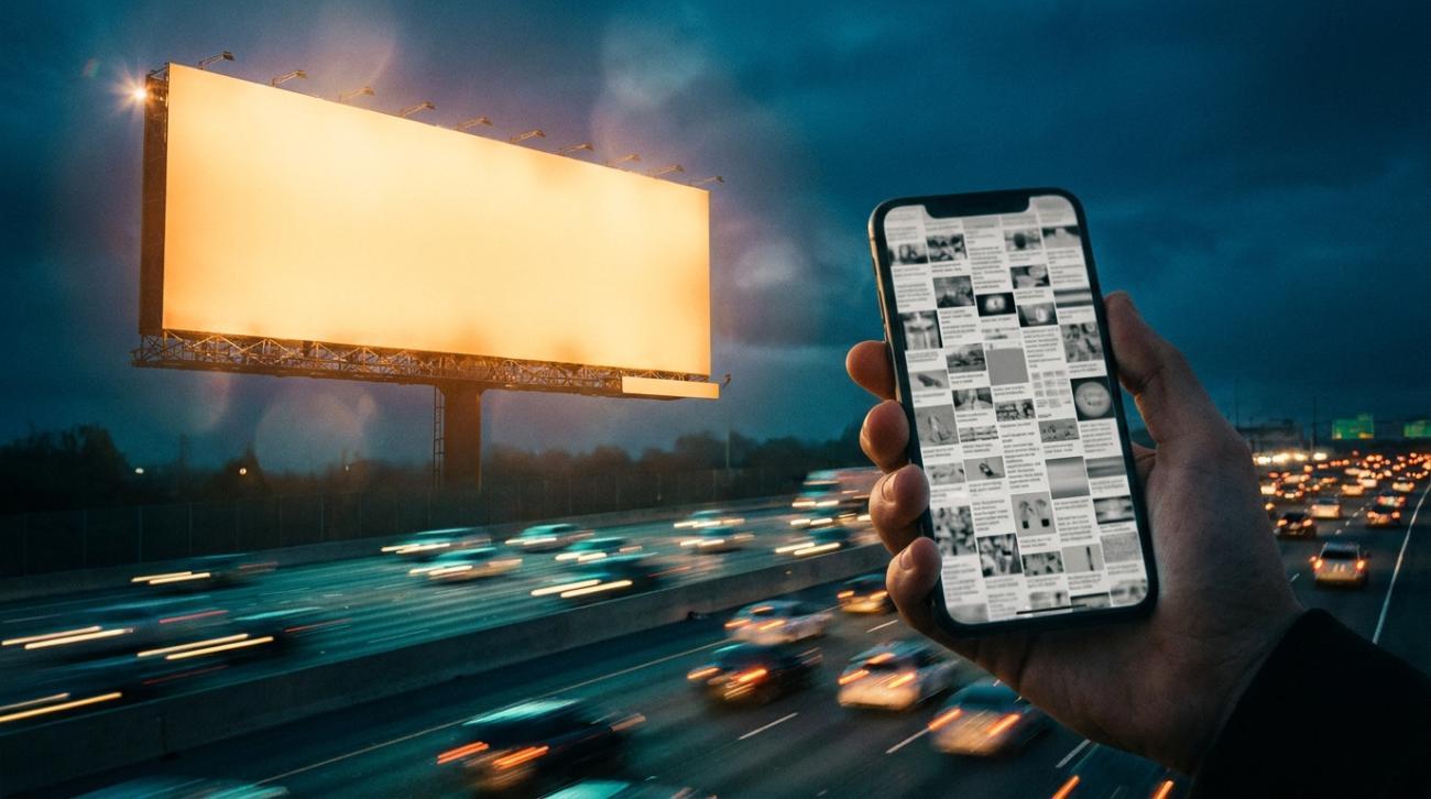
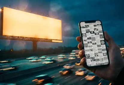
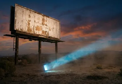
This is where the billboard analogy becomes instructive. Nobody drives past a billboard and mistakes it for part of the landscape. Billboards don't pretend to be anything other than what they are — a deliberate bid for your attention in a shared physical space. And yet, the best ones work not by shouting louder but by being more visually arresting, more clever, more memorable than the scenery around them. They earn attention through creative distinction, not through camouflage.
Native advertisers have largely abandoned that principle. As Voluum's guidance on native creative strategy reminds practitioners, you and your competitor get the same amount of pixels for an ad, and what differentiates you from others is your creativity. That advice sounds obvious, almost trivially simple. But it stands in sharp contrast to an industry that has collectively optimized for sameness. When every brand uses the same content recommendation templates, the same safe imagery, the same hedging language designed not to disrupt — creativity isn't just undervalued; it's been actively suppressed in the name of "fit."
The native advertising market is enormous and still growing — projected to reach $402 billion globally by 2025 according to industry analyses. That scale makes the creative stagnation even more alarming. Hundreds of billions of dollars are flowing into a format where the dominant strategy is to look exactly like everything else in the feed. Brands are paying premium prices to be politely ignored.
The founding promise of native — unintrusive, trust-based, seamlessly integrated — was never wrong. But the industry's interpretation of that promise has been disastrously literal. Being non-disruptive doesn't mean being devoid of visual identity. Being trust-based doesn't mean being timid. And blending into the editorial environment doesn't mean surrendering every quality that might make someone actually stop scrolling. The advertisers who understand this distinction are the ones borrowing a lesson that billboard designers have known for a century: you can respect someone's space and still command their attention. You just have to be worth looking at.
Billboard designers work under the most punishing creative constraint in all of advertising. There is no click, no replay, no second chance. A driver at highway speed grants a billboard roughly five to six seconds of attention — often less — and in that window, the entire message must land. This brutal reality has forged a discipline of ruthless clarity that digital advertisers, particularly those buying native placements, would be wise to study.
The principles are deceptively simple but extraordinarily difficult to execute well. As OOH Today has documented, the most effective boards rely on eye-catching layouts, readable typography, and clear messaging that can be understood instantly by passing drivers. That means one hero image, one message, one emotional trigger. Everything else is stripped away — not because designers lack ambition, but because the environment is merciless toward anything that requires a second look.
Consider the modern billboard's approach to minimalism versus maximalism. These aren't aesthetic preferences chosen on a whim; they are strategic decisions calibrated to context. Minimalist creative — clean layouts, bold typography, limited copy — dominates highway corridors where fast readability and strong recall are paramount. Maximalist design, with its bright colors, layered visuals, and high-energy compositions, is reserved for visually competitive urban areas where a board needs to out-shout its surroundings. Both approaches work because they are deployed intentionally. The keyword is intentionality — every element earns its place or gets cut.
Then there is the role of humor, motion-inspired layouts, and contextual messaging, all of which are becoming increasingly important in modern OOH campaigns. Clever copy and cultural references make boards more memorable, while designs that mimic movement naturally pull the viewer's eye. Location-aware messaging — a taco brand that references the exit ramp you're approaching, a gym ad that mentions the neighborhood you're driving through — adds a layer of relevance that transforms a passive glance into a moment of recognition. The board doesn't just demand attention; it earns it by feeling like it belongs in the driver's specific environment.
Now translate these constraints to the mobile feed. A thumb scrolling through a content recommendation widget is the digital equivalent of a car passing a billboard at sixty miles per hour. The user is moving, distracted, and surrounded by dozens of competing tiles. Yet native advertisers routinely violate every principle that billboard designers treat as gospel. They cram headlines with multiple value propositions. They overlay busy images with text that shrinks to illegibility on a phone screen. They ignore context entirely, serving the same generic creative regardless of the publisher, the content surrounding it, or the time of day.
The data supports the billboard designer's instinct, even in digital environments. Taboola's findings for the U.S. market show that photos without overlaying text deliver a 19% higher click-through rate than cluttered alternatives, and color images outperform black-and-white by 49%. In other words, the same principles — visual clarity, a single strong image, letting the creative breathe — produce measurably better results in native feeds just as they do on a highway median.
The billboard designer's advantage is not talent or budget. It is constraint. When you cannot add a paragraph of body copy, a secondary CTA, and a carousel of product shots, you are forced into the kind of clarity that actually reaches people. Native advertisers have no such guardrail — and it shows. The format's flexibility has become a creative liability, enabling the very clutter and complexity that a six-second window would never tolerate.
The billboard industry's creative discipline isn't a collection of aesthetic preferences — it's a set of engineering decisions honed by decades of unforgiving real-world feedback. Three of those decisions translate directly into native advertising tactics that most buyers are leaving on the table.
1. Contrast: Breaking the Visual Rhythm of the Feed
A billboard that blends into the skyline is a billboard that fails. The same principle applies to a native ad thumbnail that matches the muted, editorial tone of every piece of content surrounding it. The goal isn't to look like an ad — it's to create a moment of visual interruption that the eye cannot skip. In OOH, this means bright colors, high-energy compositions, and bold typography designed to stand out in visually competitive environments. In native, the equivalent is choosing thumbnail imagery that breaks the feed's dominant color palette — a saturated orange image amid a sea of cool-toned editorial photography, or a close-cropped face against a field of wide-angle landscape shots. Taboola's own data reinforces this: as The Native Agency reported, color photos drive a 49% higher click-through rate compared to black-and-white images. The lesson isn't "use color" — it's use color strategically, deploying visual weight where the surrounding content is visually lightweight, and vice versa. Contrast is contextual. It only works if you know what you're contrasting against.
2. Brevity: The Seven-Word Highway Test
If your headline wouldn't survive at seventy miles per hour, it won't survive at scroll speed either. Billboard designers have long understood that copy must communicate in a handful of words because highway-speed readability demands it — minimalist creative with limited copy delivers the fastest readability and strongest recall. Native advertisers should apply the same test. Strip your headline to its irreducible core. If it takes more than seven words to deliver the hook, you're writing for a reader who has already stopped scrolling — and that reader doesn't exist yet. The same data from Taboola shows that photos without overlaying text outperform those with text by 19%, reinforcing that the thumbnail should do the visual work while the headline does the verbal work. Splitting those responsibilities — rather than cramming both into a single frame — mirrors the billboard principle of giving each element a single, unambiguous job.
3. Contextual Intent: Placement-Aware Creative
The most sophisticated OOH campaigns don't just buy locations — they build creative around those locations. A billboard near a car dealership's exit ramp doesn't run the same copy as one near an airport. This practice of location-aware messaging makes boards feel more relevant to drivers in specific environments, and it's the principle native advertisers violate most egregiously. Most campaigns run identical creative across every publisher in their network — the same thumbnail and headline on a health blog, a finance site, and a celebrity news portal. As Voluum's native advertising guide emphasizes, what differentiates one advertiser from another is creative experimentation and the willingness to discover what works for specific segments and placements. A native ad for a financial product appearing on a personal finance publisher should reference retirement anxiety, not generic wealth imagery. The same ad on a news site might lead with economic uncertainty. The creative should be designed for the environment of consumption, not just the audience demographic. Think of each publisher placement as a different highway exit — and build the billboard accordingly.
These three principles — contrast, brevity, and contextual intent — aren't design philosophies to admire from a distance. They're operational playbooks, waiting to be deployed one thumbnail, one headline, and one placement at a time.
There's a predictable objection waiting in the wings whenever someone suggests applying billboard-style creative thinking to native advertising: "But the whole point of native is to blend in. If we make it bold, we destroy the trust advantage."
It's a reasonable concern — and a completely false dilemma.
Native advertising's value proposition has always rested on its non-disruptive character. As AdPushup explains, native ads succeed because they take "a soft interactive approach" that builds "an automatic higher foundation of trust" compared to more aggressive marketing alternatives. That trust is real, it's measurable, and it's worth protecting. Nobody is arguing that native ads should start behaving like pop-ups or autoplay video takeovers.
But here's the critical distinction most media buyers miss: being non-disruptive is not the same thing as being invisible. And right now, the native advertising industry has conflated the two so thoroughly that the average in-feed unit is indistinguishable from the bland content surrounding it — not because it respects the editorial environment, but because it defaults to the same washed-out stock photography, the same tepid headline formulas, and the same visual blandness that every other advertiser in the feed has already chosen. The result isn't seamless integration. It's commodified wallpaper.
The billboard industry solved this tension long ago. The best outdoor creative doesn't feel aggressive. Think of Apple's iconic silhouette iPod campaigns, or the Economist's razor-sharp wit on a red background. These boards didn't scream — they simply refused to be ignored. OOH Today has noted that both minimalist and maximalist styles work in out-of-home when "used intentionally and designed for quick comprehension." The key word is intentionally. A clean, bold billboard commands attention not by violating the visual norms of the highway or the city block, but by introducing just enough contrast, clarity, and emotional specificity to separate itself from the ambient noise. It earns the glance. It doesn't hijack it.
Native advertisers should aim for exactly the same dynamic. The goal isn't to break the publisher's aesthetic — it's to be the most compelling thing within it. That means replacing generic imagery with visuals that carry genuine emotional weight: a close-up human expression instead of a boardroom handshake, a saturated color palette instead of corporate gray, a headline that provokes a specific feeling rather than blandly describing an offer. As Voluum's native advertising guide puts it, "you and your competitor get the same amount of pixels for an ad" — what separates performance from waste is the creativity deployed within those pixels.
This is the compounding principle that too few native buyers understand: trust and attention are not trade-offs. They're multipliers. A native ad that blends in earns trust but no attention — and trust without attention generates zero clicks. A display ad that screams for attention but feels foreign earns the glance but triggers skepticism. The sweet spot — the billboard sweet spot, the great native ad sweet spot — is creative that feels like it belongs in the feed and makes the user's thumb pause. Visual boldness within editorial context. Magnetic, not aggressive.
The false binary between blending in and standing out has quietly become one of the most expensive assumptions in digital media. Every native campaign that defaults to safe, forgettable creative in the name of "non-disruption" is paying full price for a placement and then voluntarily surrendering the attention it bought. Billboards can't afford that luxury at sixty miles per hour. Native advertisers shouldn't accept it at the speed of a scrolling thumb.
Knowing that bold imagery, minimal copy, and contextual relevance work is one thing. Systematically finding proof of what's already winning in your specific vertical — and then building a repeatable process around those insights — is something else entirely. This is where most native advertisers fall short: they rely on instinct when they should be relying on intelligence.
Think about how a billboard company operates before it sells a single placement. The team drives the route. They photograph the surrounding landscape — competing signs, architectural features, sight lines, traffic patterns. They understand exactly what a driver's eye will encounter in the seconds before and after the billboard appears. Only then do they design creative that cuts through that specific environment. Native advertisers have access to the digital equivalent of this reconnaissance, yet most never use it.
Competitive intelligence tools — ad spy platforms like Anstrex, AdPlexity, or PowerAdSpy — let you audit what's currently running across native networks at scale. You can filter by vertical, by publisher, by network, by geography. You can see which creatives have been running the longest (a reliable proxy for performance, since no one pays to keep a loser alive for months). And you can systematically catalog the patterns: Which thumbnails use bold, uncluttered imagery with no text overlay? Which headlines are short enough to function like billboard copy? Which ads appear contextually matched to the editorial content surrounding them?
This audit is your route survey. Once you've cataloged the landscape, the next step is to isolate the creatives that follow the OOH-inspired principles discussed in earlier sections — high contrast, visual simplicity, contextual fit — and use those as your creative benchmarks. You're not copying them. You're identifying the structural principles that earn attention in that specific placement environment, then designing creative that outperforms on contrast, clarity, and relevance.
But intelligence without execution discipline is just window shopping. The native advertising market is projected to grow from $85.83 billion in 2020 to $402 billion by 2025, which means the feed is getting more crowded every quarter. More advertisers means more creative fatigue, which means what worked last month may already be invisible this month. You need a systematic testing framework, not a one-time creative brainstorm.
That framework starts with volume and velocity. As Voluum's native advertising guide emphasizes, there's a strong correlation between regularly refreshing ads and performance — advertisers should be adding new image and headline variations every couple of days, and no single creative should run longer than three months. This cadence mirrors the way billboard companies rotate their inventory: they know that even the most striking visual loses its power once the audience has habituated to it.
Pair that refresh cadence with rigorous split testing. Don't just swap creatives arbitrarily — test one variable at a time against your OOH-inspired benchmarks. Does a cleaner thumbnail with no text overlay outperform the cluttered version? Does a seven-word headline beat a twelve-word headline? Does a contextually relevant image matched to the publisher's editorial tone outperform a generic stock photo? Check the data daily, especially in the first days of a campaign, and use whitelists and blacklists to isolate top-converting placements so you can concentrate spend where your creative principles actually have room to breathe.
The goal isn't to turn native ads into miniature billboards. It's to adopt the billboard industry's underlying discipline: study the environment first, design for the specific attention landscape you're entering, measure relentlessly, and rotate before fatigue sets in. Intuition might spark a winning creative once. A process built on competitive intelligence and structured testing will produce winning creatives repeatedly.
The numbers are staggering, and they should make every performance marketer uncomfortable. Native advertising spend was projected to grow by 372% from 2020 to 2025, ballooning from $85.83 billion to a global market value of $402 billion. That's not a niche channel anymore. That's a dominant force in digital advertising — one that now rivals or exceeds the budgets flowing into many traditional formats. And yet, scroll through any major publisher's recommendation widget, and you'll encounter a creative wasteland: blurry stock photos, clickbait headlines with no payoff, thumbnails that look like they were assembled in sixty seconds by someone who's never studied what makes a human eye stop moving.
This is the paradox at the heart of modern native advertising. The money is scaling. The creative isn't.
Consider what billboard designers have understood for decades: when you're competing for a fraction of someone's attention in a high-speed environment, clarity, bold visuals, and strong design aren't nice-to-haves — they're survival mechanisms. Every element on that board earns its place or gets cut. Now contrast that discipline with the average native ad thumbnail. There's no compositional intention. No color strategy. No understanding of how the image will render at sixty pixels tall on a mobile screen. The result is hundreds of billions of dollars pouring into a format where the first — and often only — impression a consumer gets is a mediocre image paired with a forgettable headline.
This is a market-wide problem, but it's also a profound individual opportunity. When the creative bar across an entire ecosystem is this low, even modest improvements in thumbnail quality can produce outsized results. You don't need to be brilliant. You just need to be intentional in a sea of advertisers who aren't.
The data supports this. As Taboola's research for the U.S. market demonstrated, simple creative choices — using color imagery over black and white, removing text overlays from photos — can lift click-through rates by 19% to 49%. These aren't marginal gains unlocked through sophisticated machine learning. They're fundamental design principles that most advertisers are simply ignoring. The equivalent in billboard terms would be discovering that half of all highway ads are printed in illegible fonts — and then choosing a readable one.
The opportunity cost here is enormous. If native ad spend truly reaches the scale that analysts project, and the majority of that spend continues to fund lazy thumbnails and uninspired headlines, the collective waste could easily run into tens of billions of dollars annually. Every impression served against a poorly designed creative is money spent on an attention opportunity that was never given a real chance.
As Voluum's advertising FAQ bluntly puts it, you and your competitor get the same amount of pixels for an ad — what differentiates you is your creativity. That's not a platitude. It's the competitive reality of a format where every advertiser's canvas is identical in size, placement, and context. The only variable left is what you put on that canvas.
And right now, most advertisers are putting almost nothing worth looking at. Which means the advertiser who decides to take thumbnail craft seriously — who applies the visual rigor of a billboard designer to the constraints of a native ad unit — isn't just improving their own campaigns. They're exploiting a systemic inefficiency that most of the market hasn't even recognized as a problem. In a $402 billion ecosystem, that's not a small edge. It's a structural advantage hiding in plain sight.
Получайте лучшие конверсионные лендинги каждую неделю на свою почту.
Обязательно к прочтению
Samantha Reed
7 миниюн. 20, 2026
Подробный разбор
Dan Smith
7 миниюн. 19, 2026
Избранное
Rachel Thompson
7 миниюн. 19, 2026


