

Our spy tools monitor millions of popup and pop-under from over 90+ countries and thousands of publishers.
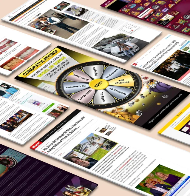
Get StartedPop-up ads are still a powerful digital marketing tool, but they can easily become annoying if not done right. The key is to create non-intrusive popup ads that improve the user experience instead of interrupting it. However, as discussed on platforms like Reddit, using too many pop-ups can frustrate users.
Studies show that when done strategically, well-designed pop-ups can achieve conversion rates of up to 40%. The secret? Making pop-ups feel like a natural part of your website's journey, similar to how in-game product placement has changed advertising by being less intrusive and more integrated into the user experience.
In this guide, you'll discover:
Ready to transform your pop-ups from interruptions into valuable touchpoints? Let's explore how to create pop-up experiences that your visitors will welcome.
Pop-up ads trigger strong reactions from internet users. Recent studies paint a clear picture of user sentiment:
Common user complaints include:
The data reveals a critical insight: users don't hate all pop-ups – they hate badly designed ones. Pop-ups that respect user experience and deliver genuine value can achieve conversion rates up to 40%.
The key lies in strategic implementation:
Successful pop-up design balances marketing goals with user preferences. Companies that master this balance see higher engagement rates and reduced bounce rates compared to those using aggressive pop-up tactics.
Non-intrusive pop-up ads come in various forms, each designed to engage users at specific moments in their browsing journey. Let's explore the most effective types that create meaningful interactions without disrupting the user experience.
Exit-intent technology tracks mouse movements to detect when users are about to leave your website. When the cursor moves toward the browser's top bar or back button, the technology triggers a targeted message to re-engage the visitor.
Scroll-based pop-ups appear when users reach specific points on your webpage, making them highly effective for engaging readers at natural content breaks. These pop-ups trigger based on the percentage of page scroll - typically at 30%, 50%, or 70% down the page.
Key Benefits of Scroll Triggers:
A case study by Digital Marketer revealed a 50% increase in email sign-ups after implementing scroll-based pop-ups at the 60% scroll mark. The success stems from targeting readers who've demonstrated genuine interest in the content.
Effective Implementation Tips:
The New York Times successfully uses scroll-based pop-ups to convert readers into subscribers, displaying subscription offers after users scroll through 75% of an article. This strategy resulted in a 31% increase in digital subscriptions.
Click-based pop-ups represent a user-initiated approach to engagement, making them naturally less intrusive than other formats. These pop-ups appear when visitors click specific elements on your website, such as buttons, images, or text links.
Key Features of Click-Based Pop-Ups:
Click triggers create a sense of control for users, leading to higher engagement rates. You can enhance their effectiveness by:
Real-World Application: A clothing retailer uses click-based pop-ups on their "Size Guide" link. When clicked, users receive an interactive size calculator tool instead of a static chart. This approach resulted in a 25% reduction in size-related returns and increased customer satisfaction.
The success of click-based pop-ups lies in their ability to deliver exactly what users expect when they choose to interact. You can maximize conversions by ensuring the content matches the trigger's context and provides genuine value to your visitors.
Creating pop-up ads that users genuinely engage with requires a strategic approach focused on user experience and behavioral patterns. The right design choices can transform pop-ups from annoying interruptions into valuable touchpoints that drive conversions.
The success of pop-up ads hinges on delivering the right message at the right moment. This requires understanding your audience's behavior patterns and creating triggers that align with their natural website interaction flow.
A data-driven approach to pop-up design helps identify which elements resonate with users. Regular A/B testing of different design variations reveals what works best for your specific audience, allowing continuous optimization of conversion rates.
A user-friendly popup design prioritizes clear visibility and effortless dismissal options. The close button should be prominent - ideally positioned in the top-right corner with a size of at least 32x32 pixels. This ensures easy tap targets for mobile users.
Your popup should respect user preferences by remembering when they've dismissed it. Set reasonable display frequencies - showing the same popup multiple times per session risks frustrating visitors and damaging engagement rates.
Pro tip: Test your popup's usability across different devices and screen sizes. A design that works well on desktop might create friction points on mobile.
Your popup design should feel like a natural extension of your website. Think of it as a seamless conversation with your visitors rather than an interruption.
Key Design Elements to Consider:
The secret lies in strategic white space usage. A cluttered popup overwhelms users, while a minimalist approach helps your message stand out. Limit your design to:
Pro Tip: Test your popup's visual impact by taking a screenshot of your website with the popup active. If it looks like it belongs there naturally, you're on the right track. If it stands out jarringly, revisit your design elements.
Remember: A well-designed popup respects your brand identity while prioritizing clarity and simplicity in its message delivery.
Your CTA can make or break your popup's success. The secret lies in creating value-driven buttons that spark genuine interest rather than pressure.
A compelling CTA speaks directly to user needs. Rather than "Subscribe Now," try "Get Weekly Marketing Tips." Instead of "Buy Today," use "Start Saving 25%."
Pro tip: Keep your CTA button text under 5 words. Test different variations to find what resonates with your audience. Remember to maintain consistent sizing and prominent placement while avoiding aggressive colors or flashing effects.
Personalization creates powerful connections with your audience - when done right. Start with basic demographic data to tailor your popup messages:
Advanced personalization techniques:
Keep personalization subtle and value-focused. A simple "Welcome back, [Name]" can feel more natural than displaying detailed browsing history. Let users control their data preferences through preference centers and clear opt-out options.
Pro tip: Test different personalization levels with small audience segments before full deployment. Track both conversion rates and popup closure rates to find the sweet spot between personalization and privacy.
A/B testing reveals crucial insights about your popup performance. Test these key elements:
Track these essential metrics:
Use heat mapping tools to understand where users click and how they interact with your popups. Implement user session recordings to identify potential friction points in your popup design.
Remember to test one element at a time for accurate results. A structured testing approach helps identify winning combinations that drive engagement while maintaining a positive user experience.
Let's explore real-world examples of brands that mastered the art of non-intrusive popup ads, a strategy that can be learned from the secrets of pop ads unleashed:
These examples share common elements:
Each case demonstrates how well-designed popups can enhance user experience while driving significant conversion rates. The success metrics prove that non-intrusive popups, when implemented thoughtfully, can become powerful conversion tools.
Creating high-converting popup ads doesn't mean sacrificing user experience. The strategies we've explored demonstrate that thoughtful design, strategic timing, and value-driven content can transform popups from annoying interruptions into powerful conversion tools.
Start small by implementing one or two techniques from this guide:
Remember: successful popup ads respect user behavior while delivering genuine value. Your visitors will appreciate the non-intrusive approach, and your conversion rates will reflect this positive experience.
Ready to share your popup success story? Drop a comment below with your favorite example of a non-intrusive popup ad that caught your attention or drove results for your business. Let's learn from each other's experiences!
Receive top converting landing pages in your inbox every week from us.
Must Read
This article explores the rise of the agentic web, where AI agents increasingly act on behalf of consumers by researching products, comparing options, and making purchasing decisions before a human ever visits a website. It explains why traditional landing pages and ad creatives optimized solely for human psychology may struggle in a future where AI systems evaluate offers based on structured data, semantic clarity, and machine-readable value propositions. The article also highlights how tools like Anstrex help marketers identify early signs of this shift by tracking competitor creative evolution, landing page changes, and emerging patterns that reveal how advertisers are adapting to both human audiences and AI-driven buyers.
Priya Kapoor
7 minJun 6, 2026
News
This article explores the largely invisible performance advertising battle that unfolds alongside the FIFA World Cup, where affiliates and media buyers compete through push notifications, pop traffic, and native ads rather than expensive sponsorships and broadcast placements. It explains how major sporting events create predictable traffic surges, cultural micro-moments, and localized audience opportunities that performance marketers can capitalize on with speed and precision. The article also highlights how tools like Anstrex help advertisers track winning push and pop campaigns, identify profitable World Cup angles, and gain a competitive edge during one of the largest advertising events in the world.
Samantha Reed
7 minJun 2, 2026
Guide
This article explores how AI-generated advertising has shifted the competitive battleground away from simple creative production and toward the quality of the intelligence marketers use to guide AI systems. It explains why advertisers relying solely on automation and mass creative generation are increasingly trapped in cycles of generic messaging, rising acquisition costs, and declining differentiation. The article also highlights how tools like Anstrex help marketers combine AI efficiency with real-world competitive data, uncover profitable campaign structures, and build more strategically differentiated advertising systems.
David Kim
7 minMay 28, 2026


