
6 минноября 4, 2025

Наши инструменты отслеживают миллионы всплывающих и pop-under объявлений из более чем 90 стран и у тысяч издателей.
НачатьВы привлекаете трафик с помощью всплывающих окон на ваши целевые страницы, но коэффициент конверсии не соответствует вашим ожиданиям. Я сам через это проходил и прекрасно понимаю, насколько раздражает, когда посетители уходят, не совершая нужных действий.
Оптимизация конверсии (CRO) для трафика из всплывающих окон отличается от оптимизации для других источников трафика. Всплывающая реклама ставит особые задачи: посетители попадают неожиданно, зачастую с низкой вовлеченностью, и у вас есть лишь несколько секунд, чтобы убедить их, что ваше предложение заслуживает внимания. Разница между конверсией 2% и 12% может полностью изменить рентабельность вашей кампании.
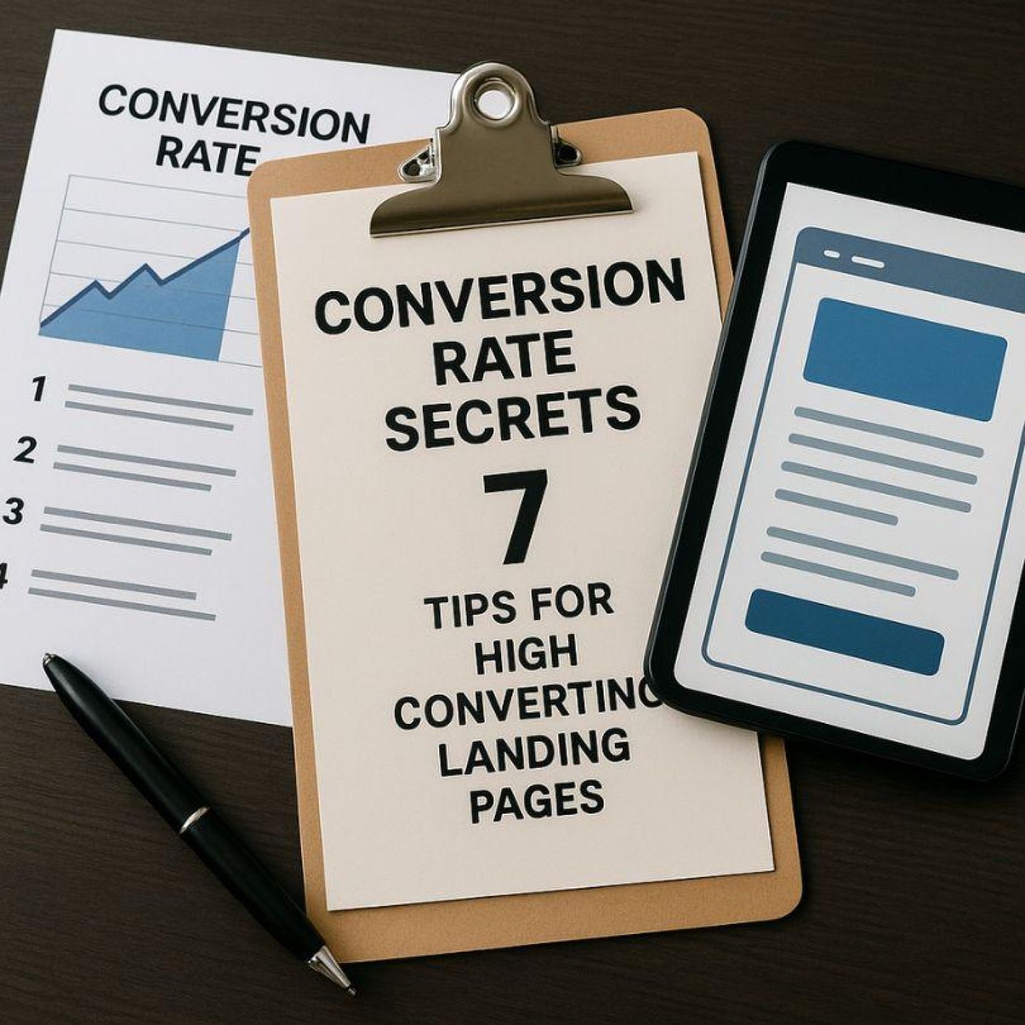
В данной статье раскрываются 7 практических секретов повышения конверсии, специально разработанных для высококонверсионных целевых страниц под всплывающую рекламу. Это не общие советы, которые можно найти повсюду. Я сосредоточусь на стратегиях дизайна целевых страниц, которые действительно работают именно для всплывающего трафика и помогают решить реальные трудности при конверсии этой массовой, но зачастую скептически настроенной аудитории.
Чтобы наглядно продемонстрировать эти стратегии, ниже приведены отличные примеры целевых страниц, успешно применивших данные секреты повышения конверсии. Вы узнаете практические методы, которые сможете внедрить уже сегодня, чтобы превращать больше посетителей из всплывающих окон в конверсии.
Pop-трафик поступает из всплывающей рекламы (pop-up, pop-under или tab-under), которая появляется, когда пользователи просматривают веб-сайты, нажимают кнопки или взаимодействуют с онлайн-контентом. Такая реклама приносит большой объем трафика по более низкой стоимости по сравнению с традиционной баннерной или поисковой рекламой.
Поведение трафика из pop-рекламы сильно отличается от других источников трафика. Вот в чём разница:
В отличие от других видов рекламы, где пользователи сами активно ищут предложение, pop-реклама создаёт особую сложность. Обычно у пользователей нет никаких предварительных знаний об этом предложении и интереса к нему. Это означает, что превращение таких посетителей в клиентов требует особого подхода.
Для эффективной работы с особенностями pop-трафика крайне важно проектировать целевые страницы специально для этой аудитории. Ниже приведены основные аспекты, на которые следует обратить внимание:
Важно понимать, что стандартные стратегии для целевых страниц могут быть неэффективны для pop-рекламы. Характер pop-трафика требует более быстрой вовлечённости, более ясных сообщений и более сильных сигналов доверия, чтобы привлечь и конвертировать эту уникальную аудиторию.
Адаптировав дизайн целевой страницы специально под pop-рекламу, вы увеличите шансы привлечь внимание и интерес посетителей и, в конечном итоге, добьётесь более высоких показателей конверсии.
Заголовок определяет, останутся посетители или уйдут в течение нескольких секунд. Четкий заголовок целевой страницы всплывающего окна должен мгновенно донести ценность вашего предложения — никаких догадок, никаких расплывчатых обещаний. Когда кто-то переходит по всплывающей рекламе, он уже настроен скептически. У вас есть, возможно, три секунды, чтобы доказать, что вы достойны его времени.
Соответствие сообщения всплывающей рекламе требует, чтобы заголовок на целевой странице точно отражал то, что обещала реклама. Если в вашей всплывающей рекламе было «Скидка 50% на премиум-программное обеспечение», на целевой странице должно быть именно это предложение, а не общее приветствие «Добро пожаловать на нашу платформу». Я видел, как коэффициент конверсии удваивался просто за счёт того, что текст рекламы и заголовок целевой страницы использовали идентичные формулировки.
Лаконичное сообщение для CRO означает удаление всего, что не служит цели конверсии. Вам не нужны:
Каждое слово на вашей странице должно направлять посетителей к одному действию. Старайтесь, чтобы заголовок содержал не более 10 слов. Используйте подзаголовки, чтобы поддерживать основное сообщение, а не вводить новые концепции. Удаляйте все элементы, создающие визуальный шум или когнитивную нагрузку — посетители с трафиком из всплывающих окон не дадут вам второй шанс донести вашу мысль.
На вашей целевой странице должна быть одна четкая инструкция. Когда вы предлагаете посетителям целевую страницу с одним CTA, вы устраняете паралич решений и направляете их к конкретной цели конверсии. Пользователи поп-трафика приходят неожиданно—они не искали ваше предложение специально. Наличие нескольких CTA отвлекает их внимание и создает путаницу относительно того, какое действие вы от них хотите.
Я тестировал целевые страницы с тремя разными CTA и страницы с одним CTA. Версия с одним CTA стабильно показывала результат на 40–60% лучше. Вы не предоставляет посетителям вариантов выбора; вы устраняете препятствия.
Оптимизация CTA для поп-кампаний требует конкретики. Вместо обобщенных кнопок вроде «Нажмите здесь» или «Отправить» используйте призывы к действию, подчеркивающие выгоду:
Обратите внимание, как каждый CTA четко сообщает, что произойдет дальше. Цвет, размер и расположение кнопки имеют значение, но именно текст подталкивает к действию. Посетители должны понимать, какую выгоду получат, а не просто механически выполнять действие. Размещайте CTA наглядно в верхней части страницы, а если страница длинная, то стратегически повторяйте кнопку, не перегружая дизайн.
Мобильные пользователи составляют большинство среди переходов в рекламных кампаниях с всплывающими окнами, обычно около 60–70% всех посетителей. Важно, чтобы ваши лендинги, адаптированные для мобильных устройств, сразу же демонстрировали свою ценность, пока пользователи не решили уйти.
При использовании стратегий адаптивного дизайна для всплывающего трафика следует создавать макеты, которые автоматически подстраиваются под любой размер экрана. Недопустимо, чтобы пользователям приходилось масштабировать контент жестом «щипка», поскольку это вызовет раздражение уже через несколько секунд после перехода на вашу страницу. Обязательно тестируйте свои посадочные страницы на различных устройствах, включая компактные смартфоны и планшеты, чтобы убедиться, что кнопки легко нажимаются, а текст остаётся читаемым без необходимости ручной настройки.
В всплывающих кампаниях скорость загрузки ваших мобильных страниц может определить успех или неудачу. Чтобы достичь наилучших результатов, используйте следующие ключевые методы оптимизации:
Помните, каждая секунда задержки при загрузке может привести к потере конверсий. Поэтому важно стремиться к тому, чтобы страницы загружались менее чем за 2 секунды при подключении через сеть 3G, поскольку многие мобильные пользователи всё ещё используют медленные сети.
У вашей целевой страницы есть несколько секунд, чтобы привлечь внимание посетителей из потоков переходов. Главные изображения в поп-рекламе служат визуальной опорой, которая либо удерживает посетителей, либо заставляет их уйти. Вам нужны изображения или видео высокого разрешения, непосредственно связанные с вашим предложением — шаблонные стоковые фото не подойдут, когда вы конкурируете за внимание пользователей, которые изначально не планировали посещать вашу страницу.
Привлекательная визуализация для повышения конверсии выходит за пределы статичных изображений. Вы можете добавить тонкие анимации, направляющие взгляд на ваше предложение, не отвлекая посетителя. Медленно вращающийся продукт, текст, плавно появляющийся в нужный момент, или фоновое видео, демонстрирующее вашу услугу в действии — такие элементы придают странице глубину. Эффекты при наведении на кнопки или изображения создают интерактивные элементы целевой страницы, поощряя любопытство, при этом сохраняя фокус на цели конверсии.
Ключевой баланс: визуальная привлекательность, усиливающая ваше сообщение, но не затмевающая его. Вы хотите, чтобы посетители взаимодействовали с вашим контентом, а не за mesmerized броскими эффектами, которые отвлекают от призыва к действию. Тестируйте различные типы медиа, чтобы определить, что лучше работает с вашей аудиторией и конкретным предложением.
Структура вашей целевой страницы напрямую влияет на то, насколько быстро посетители поймут ваше предложение и предпримут действия. Целевая страница с чистым оформлением и продуманное использование пробелов для удобства и повышения конверсии мягко направляют взгляд посетителей в сторону элементов конверсии, не перегружая их.
Размещение контента «выше сгиба» определяет, продолжит ли посетитель взаимодействовать с сайтом или сразу уйдёт. Размещайте заголовок, ценное предложение и основную кнопку призыва к действию там, где посетители увидят их без необходимости прокручивать страницу. У вас в распоряжении секунды—а не минуты—чтобы привлечь внимание трафика из всплывающих окон.
Продуманные пустые пространства — это не потерянное место. Они создают «воздух» вокруг важнейших элементов, позволяя легче воспринимать ваше сообщение. Перегруженные, тесные макеты заставляют посетителей усерднее искать информацию, увеличивая когнитивную нагрузку и снижая конверсию.
На длинных целевых страницах повторяйте призыв к действию в естественных точках—после описания ключевых преимуществ или разрешения возражений. Вы должны предлагать возможность конверсии в тот момент, когда посетитель готов к действию, а не вынуждать его прокручивать страницу вверх. Тестируйте размещение призыва к действию на отметках прокрутки 50%, 75% и 100%, чтобы определить оптимальное положение.
Важно соблюдать баланс: достаточное количество призывов к действию, чтобы охватить готовых посетителей, но не настолько много, чтобы страница казалась навязчивой или отчаянной.
Посетители из потокового трафика приходят с минимальным пониманием вашего бренда, вследствие чего отзывы, формирующие доверие, CRO играют решающую роль для успешной конверсии. Вам необходимо наладить доверие за считанные секунды, а не минуты.
Целевые страницы с социальным доказательством конвертируют лучше, если вы размещаете подлинные отзывы клиентов рядом с основным призывом к действию. Настоящие имена, фотографии и конкретные результаты вызывают доверие — общие похвалы не работают. Можно использовать звездные оценки, отрывки из отзывов или видеоотзывы, напрямую отвечающие на опасения посетителей относительно вашего предложения.
Элементы доверия для потоковых кампаний могут включать:
Вы заметите, что наиболее эффективные сигналы доверия соответствуют вашему конкретному предложению. Целевые страницы интернет-магазинов нуждаются в значках безопасности оплаты, в то время как для пробных версий программного обеспечения полезно отображать количество активных пользователей. Ключевое значение имеет стратегическое размещение — элементы доверия должны поддерживать ваш CTA, не создавая визуальной конкуренции за внимание.
Вы не можете оптимизировать то, что не измеряете. A/B тестирование landing-страниц превращает догадки в решения, основанные на данных, которые последовательно улучшают уровень конверсии. Я видел, как показатели конверсии кампаний выросли с 3% до 8% всего за счёт тестирования разных вариантов заголовков в течение двух недель.
Начните с тестирования по одному элементу за раз — заголовки, призывы к действию, цвета кнопок или главные изображения. Проводите каждый тест до достижения статистической значимости, для чего обычно требуется не менее 100 конверсий на каждую версию.
Ваш стек аналитических инструментов для CRO-оптимизации должен включать:
Тепловые карты показывают, куда именно кликают посетители, как далеко они прокручивают страницу и какие элементы они игнорируют. С помощью анализа тепловой карты я обнаружил, что посетители одной из моих посадочных страниц многократно кликали по неинтерактивному изображению — превращение его в кнопку CTA увеличило конверсию на 23%.
Следите за следующими важными метриками:
Настройте воронки конверсии в вашей аналитической платформе, чтобы точно определить, на каком этапе посетители покидают страницу. Вы можете обнаружить, что 60% пользователей достигают вашего CTA, но только 15% по нему кликают — это чёткий сигнал к необходимости тестирования другого текста или расположения кнопки.
Создайте календарь тестирования, в котором ежемесячно чередуются разные элементы. Тестируйте радикальные изменения (совершенно разные макеты) против постепенных (вариации цвета кнопки), чтобы определить, какой подход даёт лучшие результаты для вашей конкретной аудитории и типа предложения.
Создание лендингов с высоким коэффициентом конверсии под поп-трафик сводится к освоению пяти ключевых принципов: ясность посылов, сосредоточенность на одной цели конверсии, адаптация под мобильные устройства, привлекательная визуальная подача и достоверные сигналы доверия. Вы уже видели, как каждый из этих элементов помогает превратить случайных посетителей в заинтересованных клиентов.
Настоящий секрет? Ваша работа не заканчивается после запуска лендинга. Самые успешные маркетологи, которых я знаю, рассматривают стратегии CRO как непрерывный процесс, а не конечную цель. Вам нужно постоянно проводить тесты — экспериментировать с заголовками, менять призывы к действию, улучшать оформление и анализировать поведение пользователей при помощи тепловых карт и аналитики.
Секреты конверсии: дизайн лендинга для поп-трафика — это не о поиске идеальной формулы. Речь о том, чтобы понять свою аудиторию, устранить точки трения и постоянно оптимизировать на основе реальных данных. Начните применять эти семь советов уже сегодня, проводите регулярные тесты и наблюдайте, как растут ваши показатели конверсии. Ваш прорыв может быть всего в одном A/B-тесте.
Получайте лучшие конверсионные лендинги каждую неделю на свою почту.
Обязательно к прочтению
Priya Kapoor
7 миниюн. 6, 2026
Новости
Samantha Reed
7 миниюн. 2, 2026
Гайд
David Kim
7 минмая 28, 2026


