

6 minJune 29, 2026

Our spy tools monitor millions of native ads from over 60+ countries and thousands of publishers.
Get StartedPicture two creatives sitting side by side at a bar. One just returned from Cannes Lions, clutching a Gold in Film for a lush, 60-second spot that made an entire auditorium cry. The other just scaled a native ad campaign to eight figures in revenue using nothing more than a single thumbnail image and a ten-word headline. They respect each other — but they barely speak the same language.
That disconnect isn't accidental; it's structural. Award-winning brand advertising is designed for captive attention. Whether it's a Super Bowl spot, an out-of-home installation, or a cinematic online film, the audience has already been corralled — by a media buy, a theatre seat, or a pre-roll countdown timer. The creative's job is to reward that captive moment with craft, narrative arc, and emotional resonance so potent that a jury of peers will single it out from thousands of entries. Every dimension — visual spectacle, sound design, script, pacing — is engineered to stand out simultaneously. Originality is the currency, and subtlety is a stylistic choice, not a survival requirement.
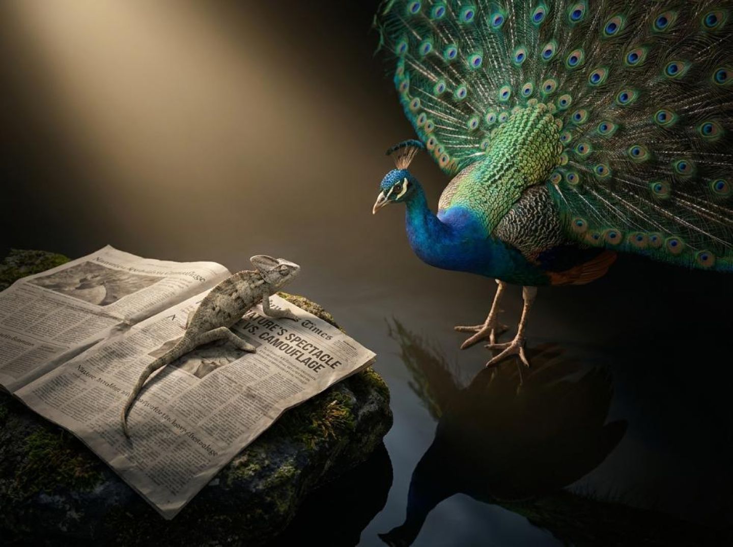
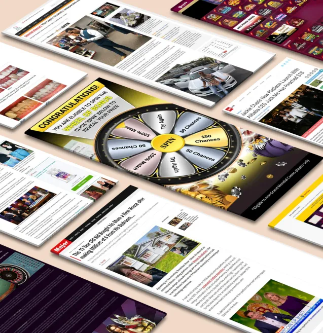
Native advertising operates under an almost perfectly inverted set of rules. There is no captive audience. There is a person mid-scroll through a news article or social feed, pattern-matching every element on the page to decide — in a fraction of a second — what deserves conscious attention and what gets flicked past with a thumb. As Basis explains, effective native ads must "match the look and feel of the content the user is already consuming, and shouldn't feel like ads." The format's prime directive is camouflage: blend into the surrounding editorial environment so seamlessly that the viewer's ad-avoidance reflex never fires in the first place. Only then can the hook — a provocative headline, an arresting image — create enough emotional friction to earn a click.
Consider the sheer difference in real estate. A brand film gets thirty to sixty seconds of motion, sound, dialogue, and music. A content-recommendation native ad gets, at most, a thumbnail image and a headline — what Voluum's advertising guide bluntly reminds us is "the same amount of pixels" every competitor also receives. There is no symphonic score, no celebrity cameo, no slow-building narrative tension. There is only a tiny rectangle and a string of words, fighting for survival against dozens of identical-looking rectangles on the same page.
This is why direct transplantation from the award stage to the native widget almost always fails. Take an award-winning concept — say, a beautifully art-directed visual metaphor — and compress it into a 600 × 400 thumbnail, strip away the copy, the context, and the 29 other seconds that made it resonate, and you're left with an image that looks like stock photography and a headline that sounds like a tagline nobody asked for. The craft that made it brilliant in one context makes it invisible in another.
The core inversion works like this: a great brand ad says, Notice me because I am extraordinary. A great native ad says, I belong here — but wait, what did that just say? One earns attention through spectacle; the other earns it through a carefully calibrated breach of expectation within an otherwise familiar frame. The brand ad's goal is admiration. The native ad's goal is curiosity — a gap between what the reader expected to see and what they actually saw, just wide enough to provoke a click but not so wide that it triggers skepticism.
Recognizing this inversion isn't a reason to dismiss award-winning creative as irrelevant to native advertisers. It's the essential first step before attempting to borrow anything from that world. Because once you understand that the two formats have opposite gravitational pulls — one toward maximum distinctiveness, the other toward contextual belonging with a single sharp emotional edge — you can start asking a much more productive question: which specific principles survive the translation, and which ones shatter on contact with the scroll?
Most performance marketers treat award-show annuals the way they treat coffee-table books — nice to look at, irrelevant to the job. That's a mistake. When you strip away the production budgets and the self-congratulatory case-study films, D&AD winners and high-CTR native ads share three structural patterns that reveal a transferable skill worth studying: emotional compression, or the art of distilling a feeling into the smallest possible unit.
Pattern 1: A single dominant visual with emotional ambiguity. Consider the iconic D&AD-winning print work for Volkswagen's "Think Small" legacy campaigns, or more recently, entries that center on a lone, arresting photograph that refuses to explain itself. The image provokes a reaction — curiosity, unease, tenderness — but withholds the reason for that reaction. This is curiosity-gap imagery at its purest. Native ads do the same thing within a far more constrained canvas. Taboola's own platform data, as reported by The Native Agency, shows that photos without overlaying text drive a 19% higher CTR, suggesting audiences respond more powerfully when a single image is left to narrate the story on its own. The lesson is the same at both ends of the prestige spectrum: one emotionally ambiguous visual outperforms a cluttered composition every time. If you're using Anstrex to audit competitor creatives, filter for single-subject thumbnails with high engagement — you'll notice the top performers almost always leave something unanswered in the frame.
Pattern 2: Headlines that imply a story rather than state a fact. D&AD Pencil-winning copy rarely announces what a product does. Think of The Economist's celebrated poster line, "I never read The Economist — Management trainee, aged 42." The headline doesn't describe the magazine; it opens a narrative loop about failure, ambition, and regret. High-performing native headlines work identically. As the Brax Blog emphasizes, linguistic creativity taps into the emotional undercurrents that drive consumer engagement and can turn browsers into buyers, and readers into advocates. The mechanism is the same: imply a story, and the reader's brain writes the middle act for you. "She Quit Sugar for 30 Days — Her Doctor Couldn't Believe the Results" is not a fact; it's the opening line of a narrative the reader must click to finish.
Pattern 3: Tension between what's shown and what's said. Some of the most decorated D&AD entries — like the long-running Harvey Nichols "Sorry, I Spent It on Myself" Christmas campaign — pair a warm, gift-giving visual with a headline that undercuts the sentiment entirely. That dissonance is what makes the ad memorable. In native advertising, the same principle manifests as a thumbnail that seems to contradict its headline: a smiling doctor beside a headline about a "hidden danger," or a serene landscape paired with a warning. Because you and your competitor get the same amount of pixels for an ad, this kind of image-headline friction is one of the few levers that genuinely differentiates creative in a crowded feed. The tension creates a micro-mystery, and micro-mysteries get clicks.
None of these patterns require a six-figure production budget. They require observation, a willingness to study creative across categories, and — critically — a systematic way to find examples. Award annuals are one swipe file. Competitive intelligence tools are another. Used together, they give performance marketers something rare: a vocabulary for explaining why a creative works, not just that it did.
Here's the uncomfortable truth about borrowing from award-winning creative: the very qualities that make a campaign jury-worthy are often the same ones that make it invisible — or worse, actively repellent — in a native feed. The translation failure isn't subtle. It's structural, and it carries a compounding cost I call the "Clever Tax": the measurable performance penalty you pay every time you prioritize wit, abstraction, or production sheen over immediate clarity.
Start with the thumbnail. A D&AD-winning visual might rely on negative space, metaphorical imagery, or a cinematic frame that rewards a second look. On a jury screen projected at five feet wide, that composition sings. Shrunk to a 300×250 widget wedged between a recipe and a celebrity breakup story, it becomes an illegible smear. Taboola's own data, as analyzed by The Native Agency, shows that simplified photos without text overlays deliver a 19% higher CTR than busier alternatives. Award-show aesthetics tend to move in exactly the opposite direction — toward layered compositions that demand parsing. Every additional element that requires cognitive effort at thumbnail scale is a viewer who has already scrolled past.
Then there's the punchline problem. Great advertising often builds toward a reveal: a twist headline, a visual double-take, a payoff that only lands if you've absorbed the setup. In a thirty-second TV spot or a full-page print ad, you have the luxury of a captive audience long enough to deliver that arc. In a native feed, you have roughly the duration of a heartbeat. A headline like "We're sorry" means nothing without the paragraphs of brand context that made it iconic for BP — and in a content recommendation widget, it reads like clickbait with no hook. The clever line that earns a knowing smile from a Cannes jury earns exactly nothing from a user scrolling at speed, because the punchline requires context that native placements never provide.
Brand-first framing is equally lethal. Award entries almost always foreground the brand — the logo, the tagline, the campaign identity. But as Basis emphasizes, effective native ads should match the look and feel of surrounding content and shouldn't feel like ads. The moment a user's peripheral vision catches a logo-heavy thumbnail or a headline that reads like a tagline, their pattern-recognition triggers ad blindness — the learned behavior of ignoring anything that looks promotional. You've spent six figures on a beautifully art-directed creative and the user's brain has filtered it out before conscious processing even begins.
Finally, there's the polish paradox. High production value is the currency of award shows, but in an editorial feed filled with raw smartphone photos and journalist headshots, a studio-lit, color-graded image doesn't look premium — it looks foreign. It signals "advertisement" as loudly as a border and a call-to-action button. The user doesn't admire the craftsmanship. They skip it, because it doesn't belong in the visual environment they're browsing.
This is why I advocate for what might sound like heresy to any brand creative director: strategic downgrading. Not sloppiness — the emotional core identified in Section 2 should remain intact. But the surface layer needs to be deliberately roughened, simplified, and de-branded to match editorial context. Strip the logo from the thumbnail. Replace the copywriter's pun with a plain-language curiosity gap. Swap the studio shot for something that could plausibly accompany a news article. You're not dumbing the work down. You're translating it into the visual and tonal grammar of the environment where it will actually be seen — and every layer of cleverness you remove is a layer of friction you eliminate between the scroll and the click.
Inspiration without a system is just procrastination. You can fill a Notion board with every Cannes Lion winner from the last decade, but unless you have a repeatable process for converting those creative sparks into testable native ad units, you're doing mood-boarding, not marketing. Here's the six-step framework that turns an award swipe file into a live test queue — with a built-in reality-check layer that keeps your instincts accountable to data.
Step 1: Curate 10–15 award-winning ads that provoke a genuine emotional reaction. Not ads you admire intellectually — ads that made you stop. Scroll through D&AD, One Show, or Effie archives and pay attention to your own physiological response: the slight inhale, the involuntary laugh, the pang of recognition. If it didn't move you, it won't move a distracted reader scrolling past a recipe article. Aim for variety across verticals so you aren't anchored to a single emotional register.
Step 2: Isolate the single strongest visual moment and the single strongest line of copy from each. Most award winners are multi-layered narratives. Your job is extraction. For each ad, identify the one frame you'd screenshot and the one sentence you'd text to a friend. These are your raw materials — the emotional cores stripped of production gloss.
Step 3: Reformat each pairing into a native-ad-sized thumbnail plus headline. Crop or recreate the visual at 300×200 pixels. Rewrite the copy line as a headline that lands in under ten words. This step alone will kill roughly half your selections — if the visual doesn't read at thumbnail scale or the copy needs a setup to land, you've identified a "Clever Tax" casualty. Discard it and move on.
Step 4: Run each surviving variant through a "native fit" checklist. Score every unit on four criteria: editorial tone (would this feel at home beneath an article on CNN or a health blog?), thumbnail clarity (can you identify the subject and emotional valence in under one second?), curiosity without deception (does the headline create an open loop you can honestly close on the landing page?), and clear conversion intent (does the reader know, even vaguely, what they'll get after clicking?). Any unit that fails two or more criteria goes back to the workshop.
Step 5: Use Anstrex to ground-truth your instincts against the market. Pull up Anstrex's native ad search and filter by the same vertical as each surviving variant. Study what's already running — not to copy, but to compare emotional patterns. Are competitors leaning on fear while your award-inspired hook uses awe? That gap could be a massive opportunity or a warning sign. As Brax has noted, the words and emotional triggers that resonate in native advertising shift constantly, so competitive intelligence isn't a one-time exercise — it's a calibration tool you revisit every testing cycle. Anstrex makes this comparison systematic rather than anecdotal, letting you see run durations, creative frequency, and network distribution for the ads already spending real money in your space.
Step 6: Queue the top variants for A/B testing — and commit to checking data daily. As Voluum's native advertising guide recommends, you should check data daily especially at the start, leveraging split testing and whitelists to discover the top-converting segments and placements. Launch no fewer than three and no more than six variants simultaneously so you generate statistical signal without diluting budget. Set a kill threshold — any variant below your minimum acceptable CTR after 48 hours and sufficient impressions gets paused, and the budget shifts to the survivors.
The entire framework is designed to impose a single discipline: every creative instinct gets filtered through performance constraints before a dollar is spent. Award shows celebrate divergence; native feeds reward resonance. This workflow forces you to find the overlap — and discard everything else.
The convergence is already here, and it's merciless. On one side, programmatic buying is scaling native inventory at a pace that would have been unimaginable five years ago, flooding feeds with more sponsored content than ever. On the other side, audiences are developing sharper instincts for filtering out noise — not through ad blockers, but through something far harder to circumvent: indifference. The result is a Darwinian squeeze. The lazy "you won't believe what happens next" clickbait that once dominated recommendation widgets is losing ground to creatives that fuse genuine emotional resonance with direct-response precision. The future belongs to marketers who are fluent in both languages.
This isn't speculation. As AdPushup's analysis of emerging native advertising trends makes clear, brands will need to get more creative with their native ads as the format matures, embracing more innovative and creative forms that push the boundaries of what is possible. That phrase — "push the boundaries" — is telling. It signals that the floor of acceptable quality is rising, not because platforms are mandating it, but because competition is enforcing it. When every advertiser can access the same inventory through the same DSPs, the only remaining differentiator is the creative itself. And "good enough" creative is becoming indistinguishable from invisible.
What does fluency in both languages actually look like in practice? It means understanding that the key to effective native advertising comes down to the creative — ads that match the look and feel of the content a user is already consuming without making them feel tricked or duped — while simultaneously building every element of that creative around a measurable outcome. It means you can write a headline with the emotional texture of a magazine cover line and the structural discipline of a split-tested subject line. It means your art director thinks in terms of thumb-stopping power and post-click congruence.
The practitioners winning this game treat the award show and the analytics dashboard as complementary inputs, not rival religions. They study Cannes reels for emotional architecture — the rising tension, the subverted expectation, the cathartic payoff — and then stress-test those structures against CTR data, conversion rates, and downstream revenue. They recognize that success in native advertising isn't just about what you say but about how and when you say it, which means the same insight that wins a creative jury can be reframed as a hypothesis for a multivariate test. A beautifully crafted narrative hook becomes Cell A. A more direct variant becomes Cell B. The data decides which survives, and the creative instinct generates the next batch of challengers.
This is the muscle that most marketing teams haven't developed yet. Brand teams still tend to optimize for aesthetic coherence and emotional impact without accountability to unit economics. Performance teams still tend to optimize for cost-per-action while treating creative as a commodity input — interchangeable thumbnails and headlines cycling through algorithmic rotation. Both approaches leave money on the table. The brand-only team produces work that's beautiful but unaccountable. The performance-only team produces work that converts today but erodes trust tomorrow, building a house on a foundation of depleting-return tactics.
The marketers who will dominate native advertising over the next five years are hybrids: creatives who can read a cohort analysis, and analysts who can articulate why one image provokes curiosity while another provokes a scroll. Building that capability isn't optional. It's the price of admission to a channel where the competition for attention is intensifying, the audience is getting smarter, and mediocrity is quietly being taxed into irrelevance.
Receive top converting landing pages in your inbox every week from us.
Must Read
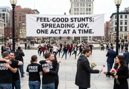
Discover how Pure Leaf’s “Break Conference” can be deconstructed as a full-funnel strategy spanning Native, Push, and Pop advertising. This guide shows how marketers can use creator content, TikTok Instream, Anstrex, search data, and PR signals to turn a feel-good brand stunt into a measurable performance engine.
Priya Kapoor
7 minSep 27, 2026
Must Read
Learn how to transform one powerful brand moment into scalable Native, Push, and Pop funnels instead of relying on a single hero ad. This guide covers modular creative, TikTok funnel thinking, competitive intelligence with Anstrex, cross-channel testing, and a repeatable creative supply chain.
Dan Smith
7 minSep 26, 2026
Editor’s Pick
Learn how OOH professionals can transfer their sales, operations, creative, and experiential skills into performance-driven Native and Push advertising. This guide breaks down how billboard expertise translates into digital media buying, channel orchestration, scroll-stopping creative, funnels, and measurable performance.
Rachel Thompson
7 minSep 26, 2026







)