9 миниюня 10, 2026

Наши инструменты отслеживают миллионы рекламных кампаний в форматах native, push, pop и TikTok.
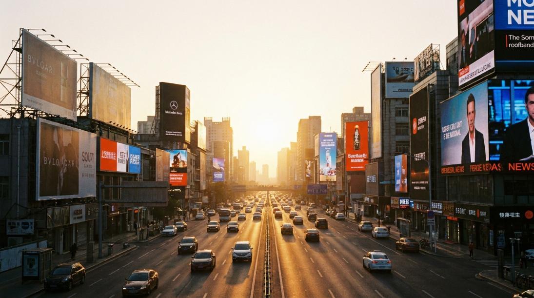
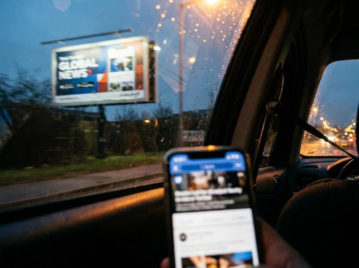
НачатьПредставьте водителя, который едет по шестиполосной трассе со скоростью семьдесят миль в час. На горизонте появляется рекламный щит, увеличивается в размерах в течение примерно трех секунд и исчезает в зеркале заднего вида. Теперь представьте пользователя, листающего ленту новостей на своем телефоне во время обеденного перерыва. Миниатюра нативной рекламы и заголовок скользят перед ее глазами примерно за то же кратчайшее время, прежде чем ее палец отбрасывает их в небытие. Разные средства распространения, разные века происхождения — но творческая задача, стоящая перед каждым рекламодателем, по сути одинакова: донести одну убедительную идею немедленно до человека, который вас не ищет, в условиях, переполненных конкурирующими раздражителями.
Вот проницательная мысль, скрытая на виду, и большинство специалистов по performance-маркетингу полностью её упускают, потому что их учили мыслить в изолированных каналах. Они изучают чужие нативные объявления в инструментах шпионажа, анализируют библиотеки Facebook и тестируют заголовки на основе других заголовков — и всё это, ни разу не взглянув на тот самый формат, который испытывался в условиях дефицита внимания уже более века. Как отмечает OOH Today в своём анализе современных тенденций билбордов, у билбордов есть всего несколько секунд, чтобы произвести впечатление, поэтому ясность, смелые визуальные элементы и сильный дизайн крайне важны. Замените слово «билборды» на «миниатюры нативной рекламы», и это утверждение останется абсолютно верным. Набор ограничений тот же самый: беспощадная простота, однозначная визуальная иерархия и сообщение, которое остаётся понятным даже тогда, когда внимание зрителя рассеяно.
Параллель выходит за рамки лишь временного окна. Оба формата существуют внутри визуально перегруженных контекстов, на которые они не могут повлиять. Билборд конкурирует с дорожными знаками, витринами магазинов, другими билбордами и когнитивной нагрузкой, сопряжённой с вождением. Нативная реклама конкурирует с заголовками редакционных материалов, виджетами рекомендуемого контента, уведомлениями из социальных сетей и всеми другими рекламными блоками, борющимися за одну и ту же полосу экранного пространства. В обоих случаях рекламодатель не может изменить окружающую среду — ему выделяется фиксированное полотно и не более того. Как указано в блоге Voluum при обращении к нативным рекламодателям, у вас и вашего конкурента одинаковое количество пикселей для рекламы, и то, что отличает вас от других, — это ваша креативность. Эта фраза с одинаковым успехом может описывать два конкурирующих билборда на одном участке магистрали, каждому из которых выделен одинаковый прямоугольник из винила четырнадцать на сорок восемь футов.
То, что делает это перекрытие столь стратегически полезным, заключается в том, что внеофисный креатив был отточен десятилетиями реальной дарвиновской борьбы. Дизайнеры билбордов давно усвоили, что второй шрифт, как правило, избыточен, что пустое пространство — это оружие, а не пустой инвентарь, и что одно доминирующее изображение всегда будет превосходить коллаж. Это не эстетические предпочтения; это адаптации к выживанию, выработанные в условиях, где неудача немедленна и очевидна — никто не останавливается, чтобы перечитать непонятный билборд. Цифровые рекламодатели, напротив, зачастую чрезмерно усложняют свои креативы именно потому, что среда позволяет это делать. Они втискивают несколько ценностных предложений в заголовок, помещают мелкий шрифт с оговорками под миниатюрами или выбирают насыщенные фото из повседневной жизни, которые на малом масштабе превращаются в визуальный шум.
Рекламодатели, которые незаметно выходят вперед, поняли, что законы внимания не меняются только потому, что поверхность меняется с винила на пиксели. Они заимствуют принципы, созданные на шоссе, и применяют их к лентам контента — и в следующих разделах мы подробно разберем, как они это делают.
Десятилетия дизайнеры билбордов решали творческую задачу, которую цифровые рекламодатели только сейчас начинают осознавать как свою собственную: как донести яркое сообщение до отвлечённой аудитории менее чем за три секунды? Решения, к которым пришли специалисты по наружной рекламе, — это не абстрактные брендинговые концепции, а конкретные правила дизайна, проверенные на скорости в семьдесят миль в час, которые практически идеально соответствуют ограничениям миниатюр нативной рекламы, заголовков и текстов push-уведомлений. Ниже приведены пять принципов, которые стоит позаимствовать.
1. Минималистичные макеты для быстрого восприятия → Чистая композиция миниатюр
Как задокументировано OOH Today, минималистичные билборды используют чистые макеты, смелые шрифты и минимальный текст для обеспечения быстрого восприятия и высокой запоминаемости, особенно на шоссе. Эквивалент в нативной рекламе — миниатюра без визуального шума: один объект, одна центральная точка, много свободного пространства. Собственные данные Taboola подтверждают это: изображения без текстовых вставок обеспечивают на 19% более высокий CTR, чем те, что перегружены надписями и значками. Когда вы позволяете одному яркому изображению говорить само за себя, взгляд зрителя не должен выбирать между конкурирующими элементами — он просто останавливается и фокусируется.
2. Жирный шрифт, креатив с приоритетом текста → нативные объявления с доминирующим заголовком
Среди самых знаковых рекламных щитов в истории есть такие, на которых практически отсутствует изображение. Представьте резкий фон и одну провокационную строку текста. Создатели наружной рекламы придерживаются подхода, при котором текст стоит на первом месте, чтобы сделать объявления максимально актуальными для проезжающих водителей. В нативной ленте это означает, что на первое место выносится заголовок, а не изображение. Четкий заголовок, насыщенный преимуществами, в паре с простым иллюстрирующим изображением, зачастую эффективнее потрясающей фотографии с шаблонным описанием.
3. Юмор и культурные отсылки для запоминаемости → заголовки, пробуждающие любопытство
Изобретательный текст и культурные отсылки всё больше важны в современных наружных рекламных кампаниях, поскольку делают их более запоминающимися. Рекламный щит, обыгрывающий популярный мем или содержащий острый слоган, откладывается в памяти — водители обдумывают его задолго после того, как его миновали. Рекламодатели в соцсетях достигают схожего эффекта с помощью заголовков, пробуждающих любопытство: они намекают, но не раскрывают суть, создавая незавершённый контекст, который читатель стремится завершить. Механизмы различаются, но лежащая в основе психология одинакова: даёте аудитории что-то настолько неожиданное, что проигнорировать это ощущается как потеря.
4. Максималистская, динамичная визуализация для конкурентной среды → Визуальный контент, останавливающий скролл в плотных лентах
Тогда как минимализм эффективен на автомагистралях, максимализм доминирует в загруженных городских перекрёстках. Яркие цвета, многослойные изображения и насыщенные композиции разработаны для того, чтобы выделяться в визуально перегруженных зонах. Плотная социальная лента или лента рекомендаций контента — цифровой аналог площади Таймс-Сквер. Здесь яркие цветные фото увеличивают CTR на 49% по сравнению с чёрно-белыми изображениями, что подтверждает: насыщенные, контрастные миниатюры сильнее привлекают внимание, когда им приходится конкурировать с десятками других карточек контента за долю секунды внимания пользователя.
5. Контекстные сообщения с учетом местоположения → Нативные размещения с учетом контекста издателя
Рекламный щит около аэропорта с надписью «Забыли зарядное устройство?» кажется жутковато персональным. Эта контекстная релевантность — соответствие сообщения окружающей среде — является тем, что используют дизайнеры наружной рекламы, чтобы точно доносить сообщения, учитывающие местоположение. Аналог в нативной рекламе — контекстная таргетизация: показ рекламы финансового планирования рядом со статьей о пенсии или рекламы спортивных добавок в публикации о здоровом образе жизни. Поскольку нативная реклама разработана так, чтобы имитировать внешний вид, ощущения и функционал редакционного окружения, согласование тематики рекламы с окружающим контентом усиливает эту нативную маскировку и делает рекламу менее навязчивой, воспринимаясь скорее как естественный следующий клик.
Каждый из этих пяти принципов решает одну и ту же основную проблему разными способами: привлечение внимания у человека, у которого почти нет на это времени. Индустрия рекламных щитов совершенствовала эти решения на протяжении десятилетий практического тестирования. Умные специалисты по нативной рекламе не должны изобретать их заново — им нужно лишь адаптировать формат.
Рекламный щит на трассе 405 не теряет своей структурной целостности через шестьдесят дней. Винил не выцветает. Освещение продолжает работать. Но для водителя, который проезжает мимо дважды в день, пять дней в неделю, к шестой неделе этот щит может быть совершенно невидим. Сообщение не изменилось — изменилась переносимость его аудиторией. Это усталость от креатива в своей чистейшей, самой аналоговой форме, и рекламодатели наружной рекламы понимают её механизмы уже десятилетия. Удивительно, сколько цифровых рекламодателей — людей, живущих внутри панелей мониторинга и одержимых показателями кликабельности — до сих пор относятся к своим креативам нативной рекламы, как будто они выгравированы в камне.
Схожесть почти пугающая. Пассажир, ежедневно проезжающий один и тот же маршрут, видит один и тот же рекламный щит примерно десять раз в неделю. Пользователь, проверяющий приложение-агрегатор новостей три или четыре раза в день, может сталкиваться с одной и той же миниатюрой nativ-рекламы с аналогичной частотой — за тем исключением, что алгоритмическая лента сжимает то, что заняло бы недели при просмотре наружной рекламы, всего до нескольких дней. Утомление от креатива не зависит от календаря; оно обусловлено плотностью показов. Чем чаще один и тот же человек сталкивается с одним и тем же рекламным объявлением, тем быстрее оно устаревает. Специалисты по планированию наружной рекламы давно это понимают, поэтому замена щитов планируется не по квартальным бюджетам, а по оценочной частоте их просмотра на определенных участках дорог.
Цифровые рекламодатели, ориентированные на интернет-аудиторию, имеют доступ к одной и той же логике, однако слишком многие запускают кампанию с небольшим количеством рекламных материалов и продолжают показывать их до полного падения эффективности. Данные однозначны: как подчеркивается в руководстве Voluum по нативной рекламе, существует сильная корреляция между регулярным обновлением рекламы и стабильной эффективностью, и ни один рекламный материал не должен работать дольше трех месяцев — это максимум, а не цель. Их рекомендация добавлять хотя бы несколько новых вариантов изображений и заголовков каждые пару дней повторяет интуитивное правило наружной рекламы: каждый цикл размещения требует свежего визуального подхода.
Рекламодатели на билбордах также давно практикуют форму сплит-тестирования, которая предшествует цифровым A/B-подходам. Вне дома (OOH) кампания может использовать два разных дизайна в коридорах с сопоставимой интенсивностью движения — один и тот же мегаполис, аналогичная плотность демографии, разные креативные решения — и измерять отклик с помощью отслеживания звонков, промо-кодов или исследований пешеходного трафика. Методология грубее, чем воронка конверсий, отслеживаемая по пикселям, но подход идентичен: никогда не предполагайте, что знаете, что работает, пока не испытаете альтернативы в контексте. Для нативных рекламодателей Voluum рекомендует проверять данные ежедневно, особенно в начале, и применять сплит-тестирование вместе со списками разрешений и запретов для выявления наиболее конвертирующих сегментов и размещений. Темп быстрее, но дисциплина остается той же.
То, что ветераны OOH интуитивно понимают, а цифровым командам необходимо усвоить, — это то, что обновление креативов — это не просто тактика оптимизации эффективности. Это необходимое условие выживания. По мере того как спрос на инновационный рекламный контент продолжает расти, бренды, повторно использующие одни и те же материалы на разных площадках и в разное время, не просто упускают клики; они сознательно приучают свою аудиторию игнорировать их. Компания, размещающая билборды на трассе в Финиксе, и не помыслит использовать тот же дизайн, что и в Сиэтле, не адаптировав его под местные условия. Однако специалисты по нативной рекламе регулярно публикуют идентичные миниатюры на совершенно разных издательских площадках — техническом блоге, журнале о стиле жизни, местном новостном сайте — будто окружающий контент никак не влияет на восприятие рекламы.
Изменение подхода незаметное, но преобразующее: перестаньте воспринимать творческое обновление как техническое обслуживание и начните рассматривать его как саму кампанию. Частота показов, а не произвольный календарь, должна определять момент ввода новых вариантов в ротацию. Каждое размещение — это отдельная автомагистраль, а каждый скролл — новый прохожий, который мимо проезжает. Те рекламодатели, кто осознал это — те, кто перенял привычку OOH-рекламы рассматривать усталость аудитории как главного врага по умолчанию, — именно они добиваются того, что их нативные кампании продолжают эффективно работать задолго после того, как творческие материалы конкурентов растворяются в ленте, словно старые виниловые пластинки на шоссе.
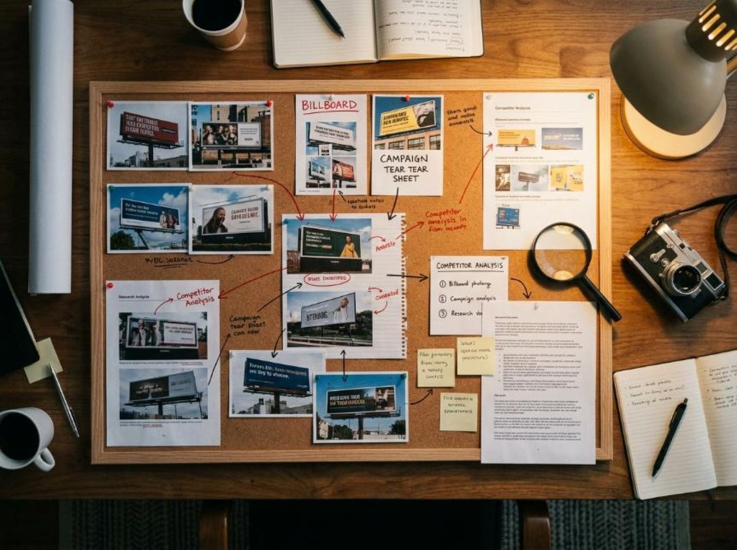
Вдохновение без системы — это просто мечтания. Если предыдущие разделы убедили вас в том, что креативы рекламы на рекламных щитах содержат принципы, применимые к нативной рекламе, то теперь пора перестать просто восхищаться билбордами и начать их анализировать. Ниже приведена четырехшаговая структура, которая превращает аналоговые наблюдения в эффективность в цифровой среде.
Шаг 1: Создайте свою подборку креативов для наружной рекламы
Вам не нужно ездить по каждой автомагистрали в Америке. Ассоциация рекламы на открытом воздухе Америки (OAAA) ведёт галереи и кейсы отмеченных наградами кампаний. Сайты вроде Ads of the World и Moat собирают образцы наружной рекламы из мировых рынков. В Instagram хэштеги вроде #billboarddesign и #OOHadvertising ежедневно показывают сотни реальных примеров. Ваш собственный путь на работу тоже имеет значение — фотографируйте щиты, которые заставляют вас задуматься, и складывайте их в отдельную папку. Цель — собрать большой объём материалов: вам нужно как минимум пятьдесят-шестьдесят примеров, прежде чем начнут проявляться закономерности.
Шаг 2: Разберите каждый щит на четыре основных элемента
Каждый эффективный билборд, независимо от его оригинальности, опирается на одну и ту же структуру. Во-первых, визуальная доминанта — одно яркое изображение или графика, привлекающая внимание. Во-вторых, ключевая фраза — редко более семи слов, построенная на контрасте, любопытстве или юморе. В-третьих, эмоциональный стимул — чувство, которое билборд хочет у вас вызвать: срочность, желание, страх упустить возможность или простое развлечение. В-четвертых, подразумеваемый призыв к действию — на билбордах почти никогда не написано "нажмите здесь", но лучшие из них делают следующий шаг очевидным через контекст (номер телефона, URL-адрес или просто название бренда, который вы позже найдете в Google). Занесите каждый щит в эти четыре категории. Всего через несколько десятков примеров вы начнете замечать группы: щиты, делающие ставку на одно эффектное фото с минимальным текстом, щиты, использующие юмор без изображения продукта, щиты, применяющие резкий контраст цветов как основное средство привлечения внимания.
Шаг 3: Преобразуйте эти элементы в компоненты нативной рекламы
Визуальная опора становится миниатюрным изображением — единственным кадром, который должен привлечь взгляд в переполненной ленте контента. Текстовый крючок напрямую превращается в заголовок, где у вас примерно такое же ограничение в семь-двенадцать слов, прежде чем читатель отвлечётся. Эмоциональный триггер формирует текст описания — строку под заголовком, которая либо укрепляет желание перейти по ссылке, либо лишает его. А предполагаемый CTA? В нативной рекламе он встроен в само обещание объявления — в причину, по которой человек верит, что содержимое за ссылкой стоит его времени. Как чётко указано в рекомендациях по креативам от Voluum, то, что отличает вас от конкурентов, использующих те же пиксели, — это ваша креативность, а эксперименты с различными комбинациями — единственный способ узнать, что находит отклик у вашей целевой аудитории.
Шаг 4: Проверка с помощью конкурентной разведки до первой потраченной копейки
Именно здесь стратегия переходит от обоснованного предположения к основанной на данных модели. Откройте инструмент поиска нативной рекламы от Anstrex и ищите по выявленным образцам: крупные одноцветные изображения, заголовки с минимальным текстом, юмористические акценты, цветовые схемы с высокой контрастностью. Отфильтруйте по продолжительности и сети, чтобы найти рекламные объявления, которые запускались достаточно долго, чтобы можно было предположить их прибыльность. Если вы обнаружите нативные кампании, уже повторяющие найденные вами OOH-образцы, вы получите подтверждение на уровне рынка, что данная структура креатива работает. Если же таких нет, возможно, вы обнаружили нишу, которую конкуренты ещё не использовали. Любой из этих результатов ценен. Учитывая, что спрос на качественный и инновационный рекламный контент растет во всех форматах нативной рекламы, рекламодатели, предлагающие грамотные и оригинальные концепции, получают всё большее преимущество.
Цикл — наблюдайте, деконструируйте, интерпретируйте, проверяйте — в первый раз занимает меньше дня, а в дальнейшем становится почти рефлекторным. Каждая поездка по шоссе превращается в фокус-группу. Каждый поиск Anstrex становится движком подтверждения. И каждая ваша нативная реклама несет в себе структурную ДНК креатива, который был проверен задолго до того, как достиг пикселя.
Цифры рассказывают историю, на которую должен обратить внимание каждый рекламодатель в цифровой среде. Ожидается, что расходы на нативную рекламу достигнут 402 миллиардов долларов к 2025 году, что на 372% больше по сравнению с уровнем 2020 года. По мере того как программатическая покупка делает нативные рекламные инвентари всё более масштабируемыми и доступными, барьеры для входа падают — а значит, пропорционально растёт барьер выделения себя из общей массы. Когда каждый может приобретать одинаковые размещения с помощью одинаковых инструментов таргетинга, единственным оставшимся фактором отличия становится креатив.
Это не гипотетическое будущее. Это уже происходит. Нативная реклама сейчас составляет почти 60% от общих расходов на баннерную рекламу в Соединенных Штатах, при этом почти три четверти расходов на нативную баннерную рекламу приходятся только на социальные сети. Этот формат зарекомендовал себя как один из самых надежных каналов для коммуникации брендов, и исследования показывают, что он является наиболее эффективным средством для повышения благосклонности к бренду. Но масштаб и надежность создают свой собственный парадокс: чем больше рекламодателей устремляются в один канал, тем тяжелее отдельной рекламе привлечь внимание. Планка качества креативов растет не просто так — она полностью пересматривается.
В таких условиях победителями среди рекламодателей станут не те, у кого самые большие бюджеты или самые сложные алгоритмы ставок. Победят те, у кого наиболее оригинальные творческие инстинкты. А оригинальность, почти по определению, не появляется, когда изучаешь свою среду в изоляции.
Это истина, которую творческие профессионалы в различных областях понимают уже на протяжении веков. Киномонтажёры изучают музыкальную композицию, чтобы понять ритм и темп. Архитекторы исследуют биологические структуры для решения инженерных задач. Хореографы заимствуют приёмы из боевых искусств. Закономерность остаётся неизменной: прорывные идеи возникают тогда, когда принципы переносятся через границы областей, а не когда происходит постепенная оптимизация в пределах одной конкретной сферы.
Мост между OOH и цифровыми технологиями, описанный в этой статье, — это лишь одно проявление мышления, основанного на взаимном обмене. Дизайнеры наружной рекламы десятилетиями совершенствовали искусство мгновенного привлечения внимания с помощью ясности, смелой визуальной составляющей и сообщений, которые доносят суть за считанные секунды — ограничения, которые удивительно хорошо соответствуют среде нативной рекламы, где миниатюры маленькие, заголовки короткие, а пользователи быстро пролистывают контент. В то же время, платформы нативной рекламы вроде Taboola собрали данные, показывающие, что принципы, которые давно применяются в OOH — например, использование изображений без наложенного текста — обеспечивают на 19% более высокий процент кликов в цифровой среде. Эти уроки не просто философски совместимы — они подтверждены статистически.
Но здесь важнее не рекламные щиты как таковые. Речь идет о ментальной модели. Крупнейшие специалисты в области native-рекламы не считают себя «маркетологами в интернете». Они считают себя коммуникаторами, которые временно работают в цифровой среде. Они изучают дизайн упаковки, чтобы понять эстетику на полке. Они анализируют обложки журналов, чтобы понимать иерархию. Они наблюдают, как уличные художники привлекают внимание в захламленных городских условиях. Любая среда, которая когда-либо конкурировала за внимание людей в физическом мире, может чему-то научить того, кто соревнуется за внимание в ленте.
По мере того как рынок нативной рекламы стремится к отметке в 402 миллиарда долларов, возникает соблазн сильнее опираться на автоматизацию, алгоритмическую оптимизацию и лучшие практики внутри платформ. Эти инструменты имеют значение. Но это лишь базовый минимум. Те рекламодатели, которые смогут выделиться, будут обладать тем, чего алгоритм не может создать самостоятельно: креативным взглядом, сформированным за счёт наблюдений за пределами экрана, в богатом и проверенном временем мире привлечения внимания, существовавшем задолго до появления ленты новостей.
Получайте лучшие конверсионные лендинги каждую неделю на свою почту.
Популярное
Elena Morales
7 миниюл. 23, 2026
Самое читаемое
Маркетологам, ориентированным на эффективность, не нужны громоздкие языковые модели для создания эффективных креативов нативной рекламы — им нужны лучшие обучающие данные. Небольшие языковые модели, работающие на основе проверенных корпусов рекламных материалов конкурентов, могут быстрее, дешевле и в необходимом масштабе создавать качественные варианты креативов, необходимые для современного маркетинга, ориентированного на эффективность.
Priya Kapoor
7 миниюл. 23, 2026
Избранное
Контент-календари не успевают за сегодняшним ландшафтом рекламы, где эффективные креативы тестируются, заменяются и оптимизируются ежедневно. Бренды, которые полагаются на конкурентную разведку в режиме реального времени и постоянную итерацию креативов, получают решающее преимущество перед теми, кто до сих пор рассматривает актуальность контента как квартальное SEO-упражнение.
Samantha Reed
7 миниюл. 22, 2026

