
9 minJune 14, 2026

Our spy tools monitor millions of native ads from over 60+ countries and thousands of publishers.
Get StartedEvery year, the D&AD jury gathers to celebrate advertising that demands attention — work so visually arresting, so conceptually daring, that it practically grabs you by the collar. Cannes Lions and The One Show operate on the same wavelength: judges reward craft, originality, and the kind of cultural provocation that turns a 30-second spot into a talking point. The scorecard is aesthetic and emotional. Did the work make you feel something? Did it redefine what an ad could be? Did it make you jealous you didn't think of it first? A Yellow Pencil is, in essence, a trophy for making people stop and admire an advertisement as an advertisement.
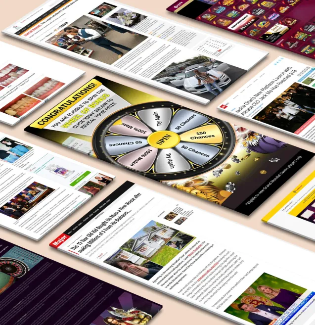
Now flip the scorecard entirely. In native advertising, the single most important measure of success is whether the audience clicked — and what happened after they did. The metrics that matter are click-through rate, conversion rate, cost-per-acquisition, and return on ad spend. According to recent data compiled by AdPushup, desktop native CTRs average around 0.15 percent while mobile native ads push past 1 percent — numbers that may sound modest until you realize they consistently outperform traditional display. On platforms like Taboola, where performance marketers spend billions annually, even fractional CTR improvements translate into significant revenue shifts. Taboola's own trend data for the U.S. market shows that details as granular as using color photos over black-and-white imagery can lift CTR by 49 percent, and removing text overlays from images drives a 19 percent improvement. These are not the concerns of a jury deliberating over a Pencil. These are the concerns of someone who needs a dollar back for every seventy cents spent.
The divergence isn't simply a matter of different metrics applied to the same creative output. These two scorecards actively incentivize opposite decisions. Award-show work thrives on disruption — it interrupts, provokes, and announces itself. Native advertising's entire value proposition runs in the other direction. As AdPushup explains, native advertising platforms succeed precisely because ads "don't stand out as being ads — instead, they appear to be a natural part of the content that users are viewing." The best native ads disappear into the feed. They mimic the editorial habitat so faithfully that the user engages with them the same way they would with an article or a listicle published by the site itself. As Basis highlights in its analysis of what separates effective sponsored content from forgettable efforts, the medium's prime differentiator is "non-disruption — they blend naturally into the form and function of the editorial habitat in which they live."
Think about what that means in practice. An award-show entry gains points for being unmistakably, unapologetically an ad — bold typography, cinematic production, a logo reveal that feels like a curtain call. A native ad gains clicks by being none of those things. One system rewards standing out; the other rewards fitting in. One celebrates the creator's voice; the other privileges the publisher's voice. Trying to optimize for both simultaneously is like training for a sprint and a marathon with the same workout: the goals aren't just different, they're structurally incompatible.
Pretending otherwise has a real cost. When performance marketers chase award-style creative in their native campaigns — prioritizing visual spectacle and brand cleverness over contextual relevance and editorial camouflage — they don't just miss trophies. They tank their CTRs, inflate their acquisition costs, and burn budget that could have driven measurable results. The two games aren't just scored differently. They're played on entirely different fields.
If you want to understand just how violently native advertising performance data contradicts award-show aesthetics, start with color. Taboola's U.S. data reveals that color photos boost click-through rates by a staggering 49% compared to black-and-white imagery. Now think about the work that earns D&AD Pencils. Flip through any recent annual and you'll find a parade of moody monochromes — desaturated palettes, brooding shadows, and the kind of tonal restraint that signals "serious craft." Apple's long-running "Shot on iPhone" campaign, frequently lauded by award juries, often leans into high-contrast black-and-white portraiture. Luxury and automotive brands routinely strip color to convey sophistication. In a jury room, that restraint reads as confidence. In a native ad feed, it reads as invisible. A 49% CTR gap isn't a rounding error or a matter of subjective taste; it's the difference between a campaign that pays for itself and one that hemorrhages budget while looking beautiful.
The second data point is equally counterintuitive for anyone trained in the traditions of art direction. Award-winning print and digital ads worship typography. Think of the iconic D&AD-recognized Economist campaigns — nothing but a stark red background and a single, devastatingly clever line of white text. Bold typographic overlays are a hallmark of prestige creative: they demonstrate wit, compress meaning, and give art directors a chance to showcase craft in letterform. But Taboola's platform data shows that images without any text overlay deliver 19% higher CTR than those cluttered with words. In native environments, the surrounding editorial content already supplies the headline; an image weighed down by additional text signals "advertisement" rather than "content worth clicking." The simplified, text-free photo does exactly what the best native advertising should do — it blends naturally into the form and function of the editorial habitat in which it lives, triggering curiosity instead of resistance.
Then there's the finding that would make most creative directors wince. Including animals in a native ad thumbnail lifts CTR by an additional 12%. Animals — the visual crutch that award juries have spent decades dismissing as the cheapest trick in the book. The joke in agency circles is well-worn: "Can't crack the brief? Stick a puppy in it." D&AD judges explicitly penalize gratuitous cuteness; conceptual minimalism and intellectual rigor dominate the shortlists. Yet the data doesn't care about intellectual rigor. A golden retriever in a saturated, text-free thumbnail will statistically outperform a painstakingly art-directed monochrome composition every single time, because native advertising operates on an entirely different emotional register. The viewer isn't leaning forward to appreciate craft; they're scrolling past dozens of editorial thumbnails, and the image that triggers a primal flicker of warmth or curiosity earns the click.
Stack these three findings together and the composite picture is striking. The ideal native ad creative — vibrant color, no text on the image, an animal adding warmth — is essentially the photographic negative of a D&AD Pencil winner. One is designed to stop a jury; the other is designed to stop a thumb. The uncomfortable truth is that in native environments, the "ugly" ad wins, not because audiences lack sophistication, but because the context demands a completely different visual contract. Craft still matters, but it expresses itself through relevance and restraint rather than artistic showmanship — through knowing when to strip away the very elements that award stages celebrate.
The prestige creative model operates on a single imperative: Be unmistakably yourself. Own the frame. Make the audience come to you. A D&AD Pencil winner announces its brand with the confidence of a headliner walking onstage — every element, from typography to tone, engineered to be distinctive, disruptive, and impossible to confuse with anything else. Native advertising asks for something that feels almost heretical by comparison: Become the frame. Look like everything else. Let the audience stumble into you.
This isn't a marginal stylistic preference. It's the foundational mechanism that makes native work. At its most basic level, native advertising is paid media that matches the content of a media source, designed so thoroughly to mirror its surroundings that it functions as a seamless extension of the editorial experience. The ads don't stand out as being ads — instead, they appear to be a natural part of the content users are already consuming. That disappearing act is the entire point. Where a Cannes Grand Prix winner earns applause for breaking the fourth wall, a native ad earns clicks by never letting the audience realize there's a wall at all.
The performance data confirms this philosophy. Consumers hold a generally positive attitude toward native advertising, but that goodwill is conditional — it depends on the ads feeling relevant to the editorial context and being associated with trustworthy brands. The moment a native placement shatters the reading experience with aggressive brand identity or visual spectacle divorced from its surroundings, it triggers the same skepticism that has made traditional display advertising so easy to ignore.
This is why the most celebrated native campaigns don't look like campaigns at all. Sponsored content on BuzzFeed reads like the quizzes and listicles that surround it. Paid stories in The New York Times adopt the paper's signature longform journalism structure, its restrained typography, its data-rich visual storytelling. As Basis has documented, the most effective native ads abide by the medium's prime differentiator — non-disruption — blending naturally into the form and function of the editorial habitat in which they live. The truly great campaigns offer hyper-relevant content in a manner that exudes authenticity, providing education and entertainment simultaneously. They succeed not because they scream "brand" but because they whisper "editorial."
This creates a philosophical tension that goes deeper than format or aesthetics. Award-show culture prizes brand distinctiveness above almost everything else. The entire craft hierarchy — the obsession with owning a color, a typeface, a visual language — exists to ensure that a brand is never mistaken for anything other than itself. But native advertising rewards exactly the opposite instinct. The brand must subordinate its identity to the publisher's look and feel, adopting someone else's typographic conventions, someone else's image style, someone else's editorial voice. The logo shrinks. The brand palette disappears. The tone bends toward journalism or entertainment rather than persuasion.
Consider what this means for the creative team. A D&AD-caliber art director spends years learning to make work that is unmistakably theirs — to impose a visual signature so strong it becomes a cultural artifact. Native advertising asks that same art director to produce work that is unmistakably The Atlantic's, or The Washington Post's, or BuzzFeed's. The skill required is real and demanding, but it's the skill of editorial camouflage, not brand spectacle. Native rewards humility. Awards reward bravado. And until the industry reconciles those two value systems, the work that performs best in feeds will continue to look nothing like the work that wins on stage.
The principles we've outlined — color over monochrome, simplicity over complexity, editorial camouflage over brand spectacle — aren't abstract guidelines. They play out with remarkable consistency when you drill into specific verticals, and the patterns reveal just how wide the gap is between what wins awards and what wins clicks.
In food, the iPhone eats first. The food ads that perform best in native environments look like the photos your friend texts you from a restaurant — bright, slightly imperfect, shot from above with natural light and saturated color. This aligns perfectly with Taboola's U.S. data showing that color imagery drives 49% higher CTR than black-and-white, but in food the effect is amplified because color is the product. A vibrant overhead shot of a grain bowl with visible texture — glistening pomegranate seeds, rough quinoa, a smear of bright green tahini — registers as editorial content on a recipe site or lifestyle feed. It belongs. Contrast that with the art-directed food campaigns that sweep awards shows: moody lighting, negative space, a single drip of sauce frozen mid-air against a matte background. Beautiful work. Terrible native performance. The stylization announces itself as advertising, and native audiences scroll past anything that breaks the editorial contract. The winning formula in food native is embarrassingly simple: shoot it like a food blogger, not a food photographer.
In tech, the curiosity gap devours the product launch. Award-winning tech campaigns tend toward the cinematic — sweeping reveals, minimalist product shots against infinity curves, a single line of aspirational copy. In native, none of that survives first contact with a content recommendation widget. What works instead is the ugly-but-irresistible curiosity headline paired with an unpolished product shot that looks like someone snapped it on a desk. "Engineers Are Obsessed With This $40 Gadget" outperforms "Introducing the Future of Sound" every time, because the former reads like an article and the latter reads like an ad. The visual data reinforces this: ads with clean images free of overlaying text achieve 19% higher CTR, meaning those sleek product shots with specs and logos layered on top actively suppress engagement. Let the image look like a thumbnail for an article, not a billboard, and the click follows.
In automotive, the listicle kills the hero shot. Car advertising is perhaps the most award-obsessed vertical in existence — vast desert roads, cinematic drone shots, a lone vehicle gleaming against a sunset. And in native, almost none of it works. What converts is story-first content: "7 SUVs That Actually Hold Their Value," "The Real Cost of Owning an EV in 2024," comparison guides that feel like automotive journalism. The creative that accompanies these pieces looks editorial — a car in a parking lot, a dashboard shot, a real-world context image — not a $500,000 production still.
What makes all of this scalable is the convergence of native formats with programmatic buying. As AdPushup has documented, the shift from bespoke publisher partnerships to automated buying across in-feed, content recommendation, and promoted listing formats means brands can test dozens of creative variations simultaneously across thousands of placements. This is the industrialization of "good enough" creative — not one perfect ad, but fifty decent ones systematically optimized until the data surfaces a winner. The most effective native advertising, as Basis has noted, blends naturally into the editorial habitat in which it lives. Across food, tech, and auto, that principle holds with almost monotonous reliability. The ads that perform don't look like campaigns. They look like content. And they scale not through singular artistic vision but through relentless, programmatic iteration.
Every creative agency has a wall — sometimes literal, sometimes digital — where the best work goes to live forever. It's the trophy case, the recruitment reel, the thing that gets shown to prospective clients over espresso in a glass-walled conference room. The problem is that "best" on that wall almost never means "highest-performing." It means most visually striking, most conceptually daring, most likely to make a jury of other creative directors nod in quiet admiration. And this is the engine that drives a profound mismatch between the creative that agencies want to make and the creative that native advertising actually rewards.
The incentive structures are hiding in plain sight. A creative director's career trajectory is built on award wins and portfolio prestige, not on click-through rates for a Taboola widget. Junior creatives are recruited based on the conceptual ambition of their book, not their ability to produce fifty image variants optimized for editorial camouflage. Agency new-business pitches lean on case studies featuring cinematic production values and provocative brand statements — the kind of work that earns coverage in trade press and speaking invitations at Cannes. None of these incentives align with what native advertising demands, which is why award-caliber aesthetics keep showing up in native placements where they actively underperform.
This isn't a creative philosophy debate. It's a principal-agent problem. The brand (the principal) is paying for results in a specific channel. The agency (the agent) is optimizing for a different reward function entirely — one that prioritizes peer recognition and institutional prestige over the client's conversion metrics. When an agency produces a beautiful, brand-forward hero image with sleek typography overlaid on a moody gradient and drops it into a content recommendation feed, they're not making a strategic choice. They're making a career choice, and the client is footing the bill.
To be fair, the craft these agencies bring to brand-building work is genuinely valuable — in the right context. A sixty-second anthem spot during the Super Bowl benefits enormously from the kind of obsessive art direction and narrative compression that wins D&AD Pencils. The error isn't in valuing that craft. The error is in assuming it transfers. Applying brand-building creative principles to a performance-native channel is a category error, like wearing a tuxedo to a trail run. The outfit is objectively impressive; it's just wrong for the terrain.
The terrain of native advertising rewards a fundamentally different definition of creativity. As AdPushup has noted, the demand for quality and innovative ad content is rising, but innovation in this context means format experimentation and contextual relevance — not aesthetic prestige. It means testing whether a close-cropped photo of a dog outperforms a studio-lit product shot, or whether a question headline drives more engagement than a declarative brand statement. Meanwhile, the Native Agency Blog emphasizes that success in native advertising depends on having the right strategic partner who prioritizes agility and data-driven iteration over grand artistic vision. The agencies that win in this space aren't the ones with the most celebrated creative departments — they're the ones willing to let performance data overrule the creative director's gut.
Performance marketers who let agency prestige bias dictate their native creative are paying what amounts to a craft premium for worse results. They're buying the tuxedo, admiring the tailoring, and then wondering why they can't keep up on the trail. The fix isn't to abandon craft — it's to redefine what craft means in a channel where the audience didn't ask to see your ad, doesn't know your brand, and will scroll past anything that looks like it's trying too hard.
The tension between award-winning craft and native performance isn't a binary — it's a spectrum, and the most interesting work happens when you stop treating these as opposing philosophies and start borrowing deliberately from each. What follows is a framework for what I call "Performance-Native Creative": work that respects the data-driven realities of feed environments while refusing to abandon the storytelling instincts that make advertising memorable in the first place.
Start with the platform's visual grammar, not your brand guidelines. The first principle is non-negotiable: the creative must blend naturally into the form and function of the editorial habitat in which it lives. This means your thumbnail shouldn't look like a cropped billboard. It should look like a photo a journalist chose for a story. Use color — always color, since Taboola's data shows that vibrant imagery skyrockets CTR by 49% compared to monochromatic alternatives — but make that color editorial rather than branded. A warm kitchen scene, not a product shot on a gradient background.
Write the headline a curious reader would click, not the tagline a creative director would applaud. D&AD-winning copy tends toward the oblique, the poetic, the conceptually layered. Native headlines need to promise a specific emotional or informational payoff within eight words. The trick borrowed from award culture: make that promise feel fresh. "What Runners Eat After Dark" borrows curiosity-gap mechanics but carries the specificity and voice of a magazine cover line.
Let the image do the talking — literally, without text. One of the most counterintuitive findings in the performance data is that clean, text-free visuals consistently outperform graphics with overlaying copy, driving a 19% higher CTR according to recent platform analysis. This is where agency instinct and platform data actually agree: the best art directors have always known that a powerful image shouldn't need a caption to arrest attention. Strip the logo lockup out of the thumbnail. Save the branding for the landing page.
Borrow emotional architecture from long-form campaigns. Award-winning work excels at emotional escalation — tension, surprise, resolution. Native content rarely has sixty seconds of video to build that arc, but you can compress it. The headline creates tension ("The Ingredient Doctors Want Banned"), the thumbnail creates surprise (something unexpected, maybe an animal, which can lift engagement by 12%), and the landing page delivers resolution with a story that genuinely educates or entertains.
Test like a media buyer, iterate like a creative. The final steal from both worlds: award culture teaches you to have a point of view, to commit to a creative territory and defend it. Performance culture teaches you that your instinct is a hypothesis until the data confirms it. The synthesis is to generate variations with conviction — not random A/B swaps of button colors, but meaningfully different creative angles — and then let audience behavior decide. As the industry continues its shift from manual to programmatic native buying, the volume of creative testing possible only increases, making this discipline more essential, not less.
The framework, reduced to a single sentence: make something a person would actually want to look at, read, and share — then prove it with numbers. That's not a compromise between craft and performance. It's what both of them were always supposed to be.
Receive top converting landing pages in your inbox every week from us.
Editor’s Pick
This article explores the fundamental mismatch between award-winning advertising and native advertising performance. While campaigns that win D&AD Pencils are optimized for creative bravery, visual distinction, and brand spectacle, native advertising rewards editorial camouflage, contextual relevance, and measurable outcomes like CTR and CPA. Using platform data from native advertising ecosystems, the piece demonstrates how high-performing native ads often violate traditional creative norms—favoring colorful images, minimal text overlays, and content-like experiences over artistic prestige. It ultimately proposes a "Performance-Native Creative" framework that combines storytelling craft with data-driven iteration to help marketers build campaigns that both engage audiences and drive conversions.
Rachel Thompson
7 minJun 14, 2026
Most Read
This article argues that award-winning advertising—particularly campaigns that earn D&AD Pencils—is often optimized for creative recognition rather than business outcomes. While D&AD celebrates originality, craft, and creative bravery, performance marketers operate in an entirely different environment governed by CTR, CPA, ROAS, and measurable results. The piece examines how the award circuit creates a creative echo chamber disconnected from performance realities, why creative measured in isolation is increasingly obsolete, and how modern marketers can use live campaign intelligence instead of annual award reels. It ultimately proposes a practical framework built around competitive intelligence, AI-assisted production, and continuous testing to create ads grounded in market performance rather than jury preferences.
David Kim
7 minJun 13, 2026
Must Read
This article explores the growing migration of top OOH media buyers into performance marketing and explains why the trend is accelerating despite OOH's rapid technological advancement. As AI-powered automation transforms the out-of-home industry, many of its most experienced professionals are realizing that their core strengths—audience intuition, negotiation skills, budget management, and strategic thinking—are increasingly valuable in native advertising and performance marketing. The article examines the key gap that hinders these career transitions: campaign intelligence and competitive visibility. It also highlights how ad spy tools compress the learning curve, enabling OOH professionals to transfer their skills into digital channels faster than ever before. Ultimately, it argues that automation, economic incentives, and media convergence are structurally reallocating talent toward performance marketing.
Elena Morales
7 minJun 13, 2026


