Native Ads, Pop Ads, Push Ads, TikTok Ads
6 minNovember 20, 2026

Our spy tools monitor millions of native ads from over 60+ countries and thousands of publishers.
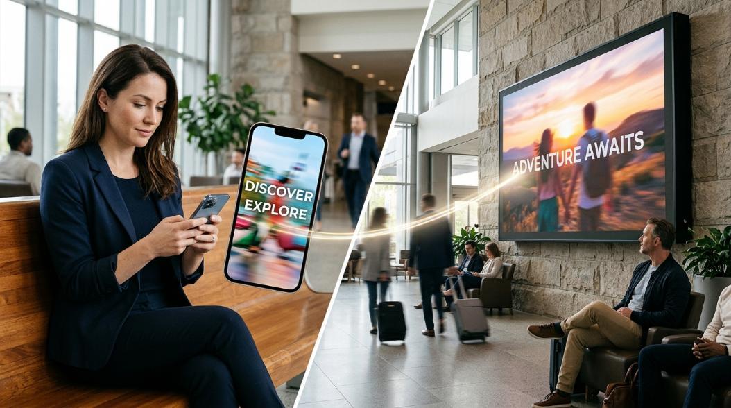
Get StartedMarketers love binaries. Short vs. long. Performance vs. brand. Scroll vs. stare. Nowhere is that more visible than in the way we talk about TikTok’s “three-second hook” on one side and out-of-home dwell time on the other, as if they’re completely different planets.
They’re not. They’re two ends of the same attention system—and most campaigns underperform because they misunderstand how those ends actually work together.
In digital, the prevailing myth is that you have only a split second to win or lose someone forever. That belief has shaped TikTok creative checklists, leading many brands to cram as much information as possible into the opening moments of a video. Yet even performance-focused guides like WordStream’s breakdown of TikTok advertising point out that this “everything in three seconds” doctrine can be counterproductive: front-loading too much detail actually reduced engagement in the research they cite. The problem isn’t that attention spans are “too short”; it’s that we confuse an initial pattern-breaking hook with the entire attention journey.
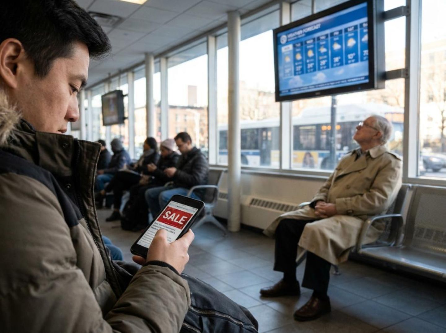
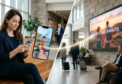
OOH makes that distinction far clearer. Place-based digital screens in supermarkets, health clubs, medical offices, and DMVs don’t win because people gaze at them uninterrupted for minutes on end. They win because they align two different types of attention: a brief, functional check-in (“Is my number up yet?”) and the longer, ambient viewing that happens while people wait. As one OOH Today analysis of dwell time notes, those quick, utilitarian glances create the opening; useful content—news, weather, trivia, health tips—keeps eyes returning to the screen so ads are experienced as part of the programming, not as annoying interruptions.
In other words, OOH doesn’t rely on a binary of “blink and you miss it” versus “captive audience.” It orchestrates a loop: hook, utility, return, repeat. That loop is what native, push, pop, and TikTok ads should be learning from—not simply the idea that “more time is better.”
If you zoom out, TikTok’s own evolution reinforces this continuum view of attention. The platform isn’t just a chaotic feed of micro-moments anymore; it’s deliberately building formats that stack exposures and extend narratives over time. TikTok’s premium units, like the Logo Takeover and Prime Time formats detailed by Neil Patel, are designed to reach users at app open and then re-engage them with a sequence of ads within a 15-minute window. That’s dwell-time thinking inside a swipe-driven environment: multiple, related impressions clustered around moments of high receptivity.
The smartest media buyers on TikTok are already treating attention as something you shape over a session, not just win or lose in a single thumb-flick. During a recent Adweek panel with award-winning agencies, leaders from Power Digital and Adquadrant described rigorous incrementality testing and always-on optimization as table stakes. They’re constantly pressure-testing how TikTok fits inside a broader media mix, which implicitly acknowledges that no single three-second interaction carries the whole load. It’s the sum of exposures—short and long, across channels—that drives results.
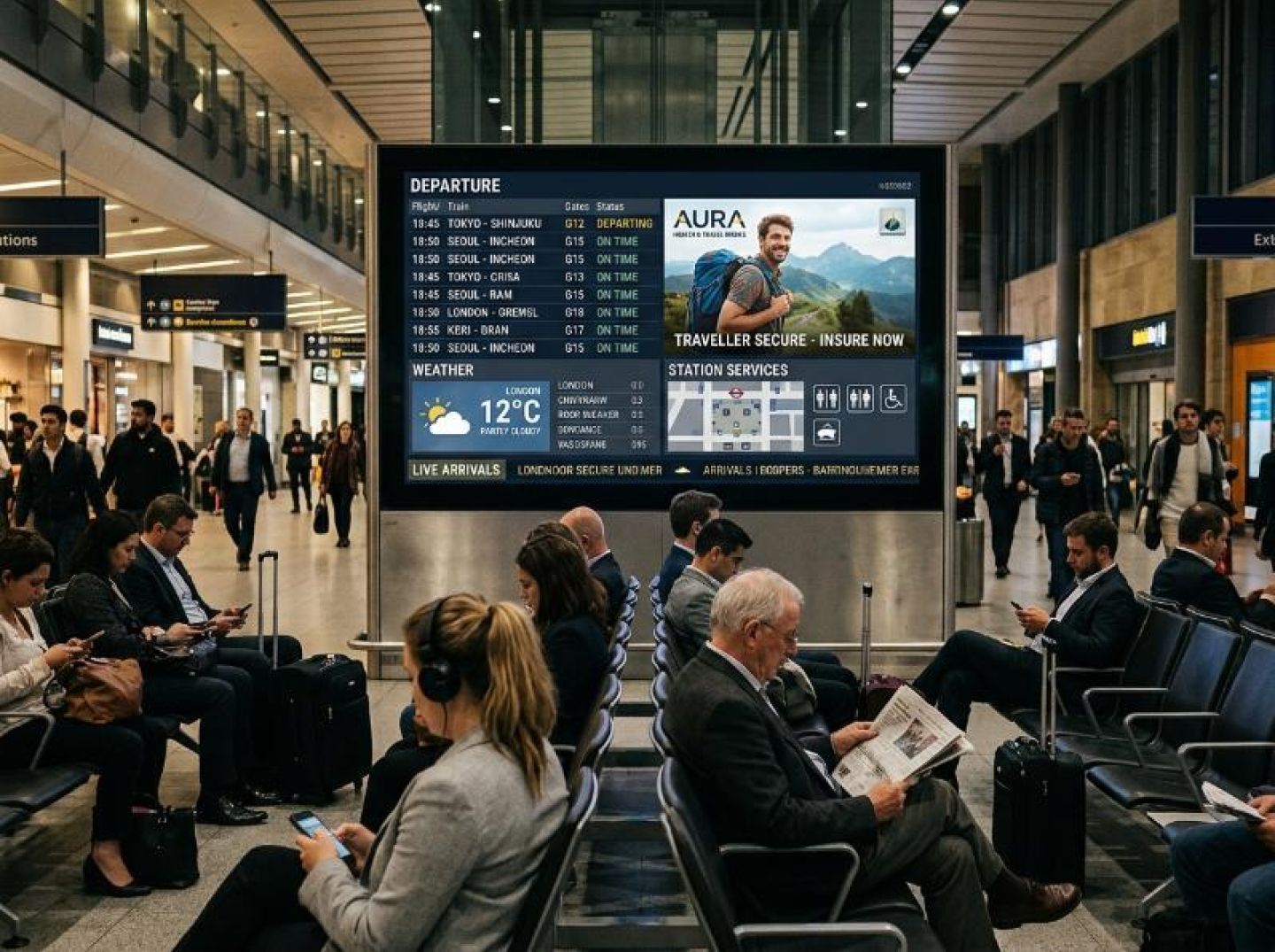
This is precisely where OOH’s “magic of dwell time” has been misinterpreted by digital marketers. The advantage of a screen in a DMV or urgent care center isn’t that someone stares at your brand for ten uninterrupted minutes. The advantage is that, over the course of a wait, that person has multiple natural reasons to look back up, and the programming cadence is built so your message is there again and again as part of the environment. As OOH Today emphasizes, location adds another layer: seeing a restaurant’s ad while you’re five minutes from that restaurant is not a “long vs. short” issue; it’s relevance colliding with timing.
So the real divide isn’t ultra-short versus dwell. It’s transactional attention versus relational attention. Swipe-culture formats like TikTok, push notifications, and in-feed native ads are incredible at buying the first glance. DOOH and other dwell-rich environments excel at building familiarity and context once that glance has happened. The marketers who will win the next wave aren’t the ones who pick a side; they’re the ones who design creative, pacing, and measurement around the full loop—from the tiny hook to the minutes-long environment where those hooks actually compound.
Out-of-home has always been honest about one thing most digital channels quietly ignore: you don’t “capture” attention; you engineer the conditions where attention becomes the easiest option.
Start with the environments where digital out-of-home thrives: supermarket checkout lines, DMV lobbies, medical offices, and gyms. As one place-based network explains, these are environments where audiences naturally have “minutes to view and interact.” The combination of time, screen visibility, useful content, and repeated exposure creates a distinctive advantage for advertisers. The screen is literally part of how people get what they came for, from checking queue status to seeing their order number called. That functional glance becomes the opening for everything that follows in the programming cycle, including ads that feel like content rather than interruptions (OOH Today).
OOH operators don’t just drop a screen on a wall and hope. They design for three specific levers of dwell time: inevitability, usefulness, and rhythm.
Inevitability is about understanding that a person cannot speed up the situation even if they want to. No one can make the DMV line move faster or magically teleport out of a waiting room. The media plan starts by identifying those pockets of forced idle time, then placing creative in direct line of sight where the “I might as well look at something” instinct kicks in. In OOH, this is a planning variable, not a creative afterthought.
Usefulness is what keeps eyeballs there once you have the glance. Instead of blasting pure promotion, place-based OOH stacks utility content—news, weather, health tips, sports scores, and local updates—around the ads. People keep checking back for information they genuinely want. In that loop, ad messages become part of the experience, surfacing multiple times in a single visit and turning one physical dwell moment into several impressions that build frequency almost automatically (OOH Today).
Rhythm is the final piece. OOH cycles are engineered so that people can catch the story even if they arrive mid-loop. Copy is sparse, visuals carry meaning at a glance, and key brand elements repeat without feeling repetitive. A person who only looks up in five-second bursts across a ten-minute wait can still piece together who you are, what you offer, and what you want them to do next—often in proximity to somewhere they can act on it, like a restaurant down the street or a branch located a few minutes from the screen.
This is exactly the logic that belongs deep inside your digital funnel. TikTok’s newer “Prime Time” format, for example, is designed to deliver up to three ads from the same brand within a 15-minute window. This aligns multiple exposures with high-engagement periods so advertisers can tell a continuous story rather than betting everything on a single, isolated hook. It is essentially a platform-native way of importing OOH’s idea of frequency within a single viewing session into a mobile, swipe-driven environment (Neil Patel).
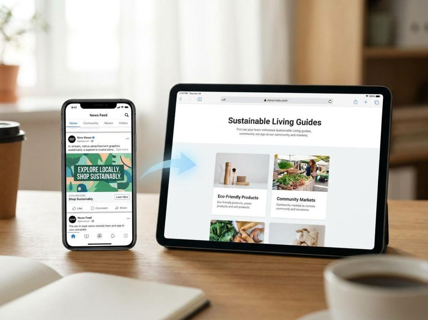
Native, push, and pop formats can apply the same OOH engineering by thinking less in terms of “one shot to get the click” and more in terms of orchestrated, environment-aware sequences. Use an initial, highly native placement that feels like content in the feed, much the way DOOH uses useful updates to earn the first glance. Then follow with richer, more immersive formats like click-to-watch or instant-play units that deepen the story once the user has chosen to engage.
This mirrors how OOH relies on simple, legible creative at a distance and more detailed storytelling when the viewer is in front of the screen (Basis).
The lesson from OOH isn’t that you must drag every impression out for minutes. It’s that you build your funnel around the reality of how and where dwell actually happens, then design content, cadence, and placement so that, when your audience runs out of reasons not to look, your brand is the most interesting thing in their line of sight.
TikTok is often treated as the purest expression of swipe culture—a place where you “win” or “lose” attention in three seconds or less. But if you listen to the people actually driving performance on the platform, you hear a very different story: the real money is made when you design creative and media around planned dwell, not accidental, drive-by views.
Even the canonical “three-second hook” has been quietly challenged. As one breakdown of TikTok best practices explains, cramming as much information as possible into the opening beats can actually depress engagement, with tests showing that overloaded intros led to about 17% lower interaction. The job of those first seconds isn’t to deliver the entire pitch; it’s to earn the right for a viewer to keep watching. That’s dwell-time thinking. The hook is the on-ramp—not the whole highway.
If out-of-home deliberately places messages where people are already waiting, TikTok in-stream inventory does something similar in reverse: users voluntarily put themselves into a lean-back, content-consumption experience. They’re not simply passing by your ad the way they pass a banner or a pre-roll; they’re sitting in a feed they’ve already chosen as their entertainment channel. The question becomes: how do you structure that experience so staying with your ad is the lowest-friction option?
Agencies that excel on TikTok treat media buying as attention engineering, not just impression harvesting. During a panel on TikTok media excellence, one agency lead described how her team uses the platform’s testing and measurement tools to constantly “pressure test what we’re running on TikTok”—dialing spend up or down based on how long people actually stay, not just whether the ad technically served. That’s the same mentality as a DOOH planner optimizing loop length and rotation to maximize how much of a story someone can absorb while waiting at a pharmacy.
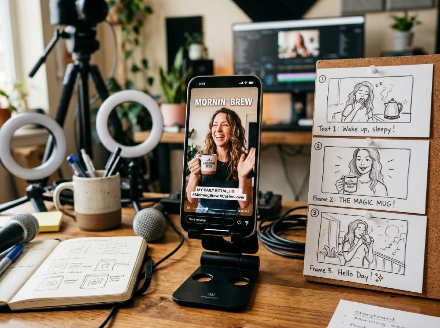
The creative side mirrors OOH logic, too. TikTok’s most successful ads don’t look like 15-second TV spots crushed into vertical video; they look like regular content with just enough narrative tension and clarity to keep viewers around. Guides for high-performing TikTok creative emphasize simple, native-feeling video—UGC, testimonials, and unboxings—over polished brand films because these formats “feel more casual, more authentic, and more trustworthy.” Authenticity isn’t just a vibe; it can help earn more seconds of focused viewing.
Once you take dwell seriously, you stop optimizing purely for thumb-stopping moments and start optimizing for the arc of the ad.
What all of this exposes is the central myth of swipe culture: that attention is so brittle you only ever get one shot, one second, one frame. In reality, TikTok and in-stream environments offer enormous potential for intentional, engineered dwell—if you plan for a viewing session instead of a lucky glance. OOH has always known that you design for the moments when attention is easiest to give. TikTok just lets you do it at 30 frames per second.
Native, push, and pop traffic all live at the opposite end of the spectrum from DMV lobbies and gym screens. You’re not working with generous, pre-existing dwell time; you’re reaching someone’s feed, lock screen, or browser in the milliseconds before they make their next move. If OOH is about patiently harvesting attention from minutes, these formats are about making the most of single, fragile seconds.
That doesn’t mean you should worship the click and ignore everything that happens after. It means you have to design two very different experiences: one for fast taps, and one for the session that—if you do your job right—follows.
Native ads win or lose on the promise baked into a tiny rectangle of space: image, headline, and a line or two of copy. Users are already in discovery mode, but their patience is measured in flicks of the thumb, not minutes. The mistake many performance marketers make is treating native strictly as a click-arbitrage game—anything to spike CTR.
TikTok’s evolution is a useful cautionary tale here. Platform leaders emphasize that strong results come from creative and media strategies that support full-funnel behavior, not just cheap initial engagement. This positions TikTok as a “full-funnel engine where entertainment, commerce, and performance meet,” as one analysis on Neil Patel’s blog puts it.
Native should operate the same way: the pre-click card sets a specific, credible expectation; the landing experience fulfills and then deepens that promise.
Design your native like DOOH programming in microform. The ad itself is the “functional glance”—the utility hook that earns a tap. The destination is your waiting-room screen: structured to hold attention with layered content, logical next steps, and clear pathways to conversion. Misaligning those two layers—a sensationalist tease followed by a thin landing experience—might juice short-term metrics but destroys the repeatability you need in an arbitrage-driven channel.
Push notifications are even more unforgiving. You interrupt someone outside of your owned environment and ask them to pivot instantly. Think of it as the most compressed version of planned dwell: you get one focused moment if the message feels relevant enough.
OOH networks earn repeated attention because screens are functionally useful. People check them for queue status and then stay for additional content woven around those updates, according to an overview of dwell-driven environments in OOH Today.
Your push has to carry both roles in a single line of text: functional value—why should I care right now?—plus a subtle content or emotional angle that makes opening feel effortless.
That’s why “fast taps vs. long sessions” is the wrong binary for push. You want fast qualification: clear enough that the right users tap quickly and the wrong ones ignore you without friction. Then the app or landing flow has to behave like a condensed OOH loop: instant confirmation that they’re in the right place, plus contextual options that make lingering and exploring feel like the natural next move.
Pop and popunder traffic is the clearest example of where swipe-culture instincts go to die. The format itself is interruptive; if the first thing a user sees is a screaming countdown timer, you’ve turned a guaranteed moment of forced attention into guaranteed hostility.
The lesson to steal from DOOH is simple: people will tolerate—and even welcome—advertising if the environment is doing something useful for them. Place-based media succeeds by embedding advertising into a mix of news, weather, and local information so ads become part of the content rather than an interruption, as one DOOH-focused analysis in OOH Today notes.
For pops, your first screen has to feel like a helpful detour, not a hijacking.
That means:
Again, TikTok’s trajectory is instructive. High-performing advertisers build a varied creative supply and then let data guide which assets earn continued investment, according to practitioners interviewed in HubSpot’s TikTok campaign breakdown. The pop world needs that same discipline: a library of variants, rigorous testing, and a feedback loop that optimizes not just for initial landings but for session depth and eventual revenue.
Across native, push, and pops, the first design challenge is speed of decision: can someone understand the offer and self-select in or out within a second or two?
But your economic upside comes from the length and quality of the experience: how you convert that micro-yes into a sequence of micro-engagements that feel as natural and absorbing as an OOH screen in a waiting room.
Design your creative and funnels with that duality in mind, and “fast” traffic stops being about cheap clicks and starts looking a lot more like compressed dwell time—small bursts of focus you can stack, nurture, and ultimately turn into durable attention.
The biggest lesson from out-of-home advertising is not that people have longer attention spans when they are standing in a waiting room. It is that attention becomes easier to earn when the environment, message, and timing work together.
That principle applies just as strongly to digital advertising.
TikTok proves that a strong hook should open a story, not carry the entire message. Native ads show why the promise before the click must match the experience after it. Push notifications demonstrate the importance of relevance and immediate clarity. Pop and popunder formats reveal that even interruptive placements can perform better when the landing experience respects the user's time and gives them a clear reason to continue.
OOH brings these lessons together through three practical principles:
For performance marketers, this changes the way campaigns should be evaluated. A high click-through rate is useful, but it does not tell the entire story. Watch time, completion rate, repeat exposure, landing-page engagement, qualified actions, and downstream revenue help reveal whether an ad is creating meaningful attention or simply generating momentary activity.
This is also where competitive intelligence becomes useful. Studying how other advertisers structure their hooks, creative variations, landing pages, and offers can reveal patterns worth testing. Anstrex can support that research by helping marketers examine competitive advertising activity and creative approaches across campaigns. The insights can inform hypotheses, but actual performance still needs to be validated through your own testing and conversion data.
The goal is not to make every digital ad longer. It is to make every second count—and to give interested users a compelling reason to spend more time with your message.
Because the strongest campaigns do more than stop the scroll. They turn that first moment of attention into an experience people choose to continue.
Receive top converting landing pages in your inbox every week from us.
Must Read
Digital advertising often prioritizes the first click or three-second hook, but effective campaigns need more than a moment of attention. By studying how out-of-home advertising uses dwell time, utility, and repeated exposure, performance marketers can build stronger creative sequences and more engaging experiences across native, push, pop, and TikTok formats.
Elena Morales
7 minNov 20, 2026
Editor’s Pick
Constant discounts can weaken perceived value and train customers to delay purchases. Learn how to use competitor ad intelligence, Anstrex Native, and TikTok storytelling to uncover premium positioning, reverse-engineer value-focused funnels, and build campaigns that give shoppers a reason to buy without waiting for a coupon.
Marcus Chen
7 minNov 19, 2026
Most Read
AI answers reveal the questions, brands, and narratives shaping buyer discovery. Learn how to capture those prompts, map their intent and entities, and connect the insights with Anstrex to research advertising creatives and landing pages across native, push, and TikTok.
Elena Morales
7 minNov 17, 2026