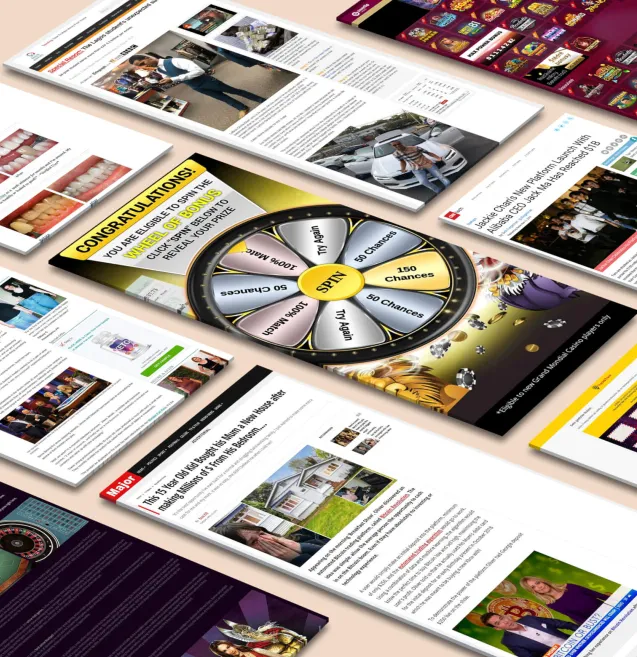

Our spy tools monitor millions of native ads from over 60+ countries and thousands of publishers.
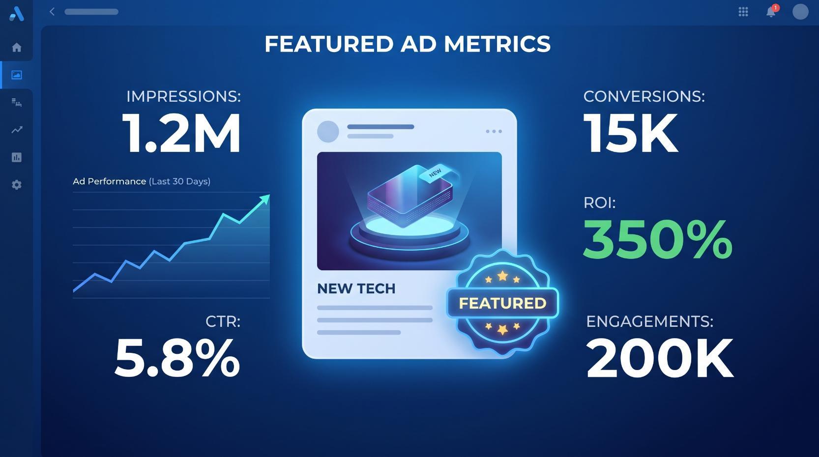
Get Started“Featured” ad galleries are designed to make you feel like you’re looking at proven winners. The layout screams: Steal these. Copy this angle. Just plug-and-play. But without metrics, those gorgeous carousels of “top” native or display creatives are little more than eye candy. You’re looking at the end result of someone’s campaign with none of the context that actually made it work—or fail.
Native and display especially suffer from this problem because, unlike direct-response formats that live and die by last-click sales, they often serve fuzzier goals like recall, affinity, and assisted anstrex.com/blog/the-impact-of-native-advertising-on-conversions-and-sales" target="_blank" rel="noreferrer noopener">conversions. As the team at Voluum notes in their overview of native ads tracking, these campaigns are frequently “just to remind you that a given brand exists,” which naturally shifts the tracking philosophy away from simple conversion counting. You’re supposed to judge them on exposure and interaction, not just purchases. Yet most “featured ad” libraries show you only the wrapper (the creative) and hide the instrument panel (the metrics).
That omission matters because creative performance in native and display is inseparable from the numbers behind it. Voluum points out that native campaigns lean heavily on metrics like CTR, CPM, CR, and bounce rate to tell you if an ad is doing its job. CTR hints at how compelling the path from ad to landing page is. CPM tells you how efficiently you’re buying attention at scale. CR shows whether the offer converts the traffic that creative is pulling in. Bounce rate reveals if people bail as soon as they arrive. Strip those out, and a “featured” ad becomes a static screenshot with no indication of whether it was a breakout performer or a budget-burning dud.
Even the most basic tension in media buying—reach versus engagement—is invisible in a metrics-free spotlight. As Brax explains in their breakdown of impressions vs. clicks, impressions describe how widely your ad is seen, while clicks reveal whether anyone actually cares enough to interact. Looking only at the creative, you can’t tell if a given ad amassed impressions because it ran forever on a bloated budget, or because it earned its keep with a strong click-through rate that justified continuous scaling. You also can’t see the nuanced patterns Brax highlights, like situations where steady impressions but rising clicks signal growing interest, or where soaring impressions with flat clicks expose a relevance problem. The “featured” tile doesn’t show you any of that narrative.
Display and video benchmarks make the missing context even more obvious. In an analysis of over 60,000 campaigns, WordStream emphasizes that visual formats accumulate impressions rapidly and often influence conversions indirectly through view-through effects, which is why their display and video benchmarks focus on metrics like CTR, CPC, cost per lead, and viewability instead of raw conversion rate. Their recommendation to avoid judging display by search-style conversion standards is a reminder that you need channel-specific performance frames. But most featured-creative libraries present display and native examples as if they were self-evidently “good” simply because they look polished or ran on big networks, without any indication of whether they hit acceptable CTRs, sustainable CPCs, or even basic visibility thresholds.
When you put all of this together, “featured” creatives without metrics actively mislead. They encourage marketers to reverse-engineer copy and design tropes out of context, assuming success where there may have been none, and ignoring crucial details like whether the ad only worked at a tiny CPM on one traffic source, or whether it tanked on bounce rate once scaled. You’re left guessing which pieces to emulate in your own pop or push campaigns, instead of using quantifiable signals—CTR curves, impression-to-click ratios, viewability, and down-funnel behavior—to build reliable blueprints. In other words, the tease isn’t the creative itself; it’s the pretense that creative alone tells you anything useful without the metrics that made it “featured” in the first place.
Before you copy a “featured” ad into your own account, you need a measurement blueprint that tells you what “good” actually looks like for your funnel, campaign type, and traffic source. The ad creative is just the surface layer; the real leverage comes from the handful of metrics you decide to live and die by.
At a minimum, you’re choosing metrics at three levels:
Those levels don’t change, but the specific numbers you watch do change between native, pop, and push.
For native-style “featured” ads, exposure and engagement form the backbone. Native often leans into brand and pre-sell, so you can’t judge performance on conversions alone. As one guide to native ad tracking explains, awareness-focused campaigns rely heavily on:
For conversion-focused native, you then add CR (landing → lead/sale) as a core outcome metric and define a minimum acceptable conversion rate for that funnel type before you ever test a lookalike ad from a gallery.
With pop and push, the metric mix shifts because the user experience and intent profile are different. Popunders hijack the entire window; push ads show up in what looks like the user’s notification layer. Each has its own strengths and constraints, which means your “featured” inspiration should be evaluated through a different lens.
For pop traffic, your non-negotiables usually include:
For push campaigns, intent and fatigue become core considerations:
Across all formats, you also need a source-of-truth layer for these metrics. A third-party ad server or tracker gives you independent stats, richer event tracking, and placement-level breakdowns so you’re not stuck with whatever partial numbers a “featured creative” showcase feels like revealing. As one overview of mobile ad serving notes, rich media and tag-based setups let you capture granular events inside the ad unit itself—not just clicks—plus viewability and secondary actions that can become optimization levers.
That’s the real secret: before you borrow anything from a “featured” gallery, you write your own measurement rules. You define what a winning CTR, bounce rate, conversion rate, and EPC look like for your pop or push funnel; you decide which in-ad or on-page events matter; and you ensure you have the tracking stack to see them. Only then does swiping creative inspiration become a strategy instead of a gamble.
Featured-ad galleries show you the tip of the iceberg: a single creative, ripped from the environment and stripped of the journey around it. Anstrex is one of the few tools that lets you dive beneath the surface—if you use it as a full-funnel reconnaissance system instead of just a swipe file.
The first mindset shift is to stop treating Anstrex like Pinterest for headlines and start treating it like an analytics and funnel-mapping tool. When you pull up a winning ad, your goal isn’t “How do I copy this creative?” but “What’s the system that made this creative worth scaling?” That means interrogating three layers: the media buying pattern, the click experience, and the conversion engine behind it.
Begin with the media side. Every spy report in Anstrex hides clues about how aggressively and where a campaign is being pushed: publishers, devices, geos, ad networks, and duration. Long-running placements and consistent impressions across multiple exchanges are often the first sign of profitability. That aligns with what display benchmarks from WordStream’s analysis of 60,000+ campaigns show: visual formats rack up huge impression volumes, and your job is to decide which combinations of audience, inventory, and format are worth paying for. When you spot a creative that’s been live for weeks across multiple high-quality publishers, you’re likely looking at a scaling campaign, not a random test.
Next, reconstruct the pre- and post-click journey. Anstrex’s landing-page previews, redirect traces, and ad-chain details are where you stop thinking “ad creative” and start thinking “funnel architecture.” Open every step: the creative, the advertorial or pre-sell, the main lander, the offer, and any multi-step forms. For each page, ask the same questions you’d ask in your own account:
This is where you marry the qualitative reverse-engineering with the quantitative metrics you defined earlier. If a competitor is driving cold traffic from native placements into a long-form pre-sell, you know impressions and click-through rate matter, but so do deeper engagement signals like scroll depth and time on page. Rich media and multi-step experiences behave like “micro-websites,” and as the team at MobileAds points out, every in-unit interaction and secondary action rate becomes optimization fuel. You won’t see their numbers in Anstrex, but you can infer what they’re optimizing for by the way the page is structured: interactive elements, sticky CTAs, exit-intent captures, and multi-offer paths are all signals that the advertiser cares about more than a single click.
From there, translate what you see into a testable blueprint rather than a carbon copy. Tools like Anstrex show you which hooks, angles, and lead types appear repeatedly across many advertisers in a niche. That repetition is a data point, not a design suggestion. If five different brands in your vertical are using symptom-driven quiz funnels, your takeaway isn’t “steal their quiz,” it’s “quiz funnels are likely a working archetype for this traffic, so I should model a quiz that aligns with my own product and benchmarks.”
Then plug that archetype into your metric framework. If your campaign is meant to drive direct leads, align your page structure and tracking to the same types of funnel KPIs that performance marketers use when they “test and track” paid campaigns with multiple creative variations. That means building in clear conversion events at each stage: ad click, pre-sell CTA click, form completion, and any micro-conversions like button hovers, tab clicks, or in-line video plays. Anstrex won’t give you those numbers, but it does tell you what to measure by highlighting which elements other advertisers deem important enough to occupy prime screen real estate.
Finally, use Anstrex’s spying not just for cloning, but for hypothesis prioritization. When you see the same creative concept paired with different landing formats—direct bridge pages, quizzes, long-form stories—you can map which variables your competitors are actively testing. Combine that with external benchmarks on viewability, cost per click, and cost per lead from industry-wide studies like WordStream’s display and video benchmarks, and you get realistic expectations for each stage of your own funnel. Instead of blindly importing a “featured” creative, you’re building a pop or push campaign with a deliberately engineered path: traffic source → creative archetype → pre-sell format → offer presentation → follow-up sequence, all chosen and instrumented to hit the specific metrics you decided would define success.
You’ve already done the hard work inside Anstrex: you’ve found native or display campaigns that are clearly working, and you’ve mapped the funnel instead of just screenshotting the ad. The next step is turning those “winners” into systematic pop and push campaigns instead of one-off experiments.
The key is to separate what’s format-specific (what only works because it’s native or banner) from what’s strategy-agnostic (angles, hooks, promises, and funnel structure). Then you rebuild that strategy inside traffic sources where interruption is more brutal, intent is lower, and volume is higher.
Start with what the ad is really doing on native or display. Strong winners usually fall into one of a few roles: pre-sell (educating and agitating), pattern interrupt (getting a click at all), or direct pitch (straight to the offer). On native, KPIs like CTR and bounce rate tell you how good the ad+landing combo is at grabbing attention and getting people to stick, while conversion rate shows whether the offer resonates, as the team at Voluum points out. For display, CTR is more of a “creative attractiveness” barometer than a conversion metric, since view-through impact often happens later, which is why WordStream’s benchmark data treats viewability and cost per lead as more meaningful levers than raw conversion rate.
When you move into pop and push, you’re not trying to recreate the format of the ad; you’re trying to preserve the role it plays in the journey while respecting the new environment.
For push, your closest cousin is a native ad: small image, short text, interruption-based, and heavily dependent on first-glance relevance. Instead of copying a “Top 7 Shocking Facts About X” headline word for word, you:
Because push users are cold and often multi-tasking, you need to be ruthless about testing micro-variants of those angles. Running multiple creative variations and watching performance by asset, the way HubSpot recommends for paid ads optimization, becomes non‑negotiable on push. Treat each winning native/display angle as a theme, then spin out several push titles and images under that theme, killing fast and reallocating spend to the combinations that break your baseline CTR.
For pop (popunders/popup traffic), the creative layer is your landing page and funnel, not the ad itself. Here you’re importing the page experience that made your native or display funnel work. If you’ve reverse-engineered an advertorial that warms people up before the offer, you can often drop that same pre‑sell into pop with minimal changes. But you must adapt the pacing:
In both pop and push, you shift your optimization stack to match the channel’s reality. You’ll still care about CTR and CPC, but on interruption traffic you live and die by effective cost per lead and cost per acquisition, similar to how display advertisers use cost per lead and viewability to judge quality at scale in the WordStream performance benchmarks. Steal those benchmark mindsets, but attach them to your own funnel math: what does “good” CPL look like for this offer on pop, given how it behaves on native?
Finally, resist the temptation to treat every Anstrex “winner” as sacred. Instead, think in systems: each proven native or display funnel gives you a blueprint—angle clusters, page structure, proof stack, and offer framing. You port that blueprint into push and pop, then follow a disciplined cycle of testing, tracking, and scaling that mirrors how HubSpot frames cross‑channel optimization: test multiple variants, track with clean pixels or server-side events, and aggressively shift budget into the pockets where that borrowed blueprint produces the strongest downstream economics.
If Anstrex is where you discover a working story, Brax is where you deploy that story at scale without losing the plot.
Most affiliate teams get this backwards: they obsess over finding the perfect “featured” ad and then wing the rollout on pop, push, and native. The result is a pile of disconnected campaigns with no shared structure, no shared metrics, and no way to tell which “winner” actually deserves more budget.
The fix is a Brax‑first workflow, backed by disciplined tracking, that turns every Anstrex insight into a repeatable, multi‑channel blueprint.
Start by treating Brax as the source of truth for your creative and account structure, not just another dashboard. Because Brax can manage native campaigns across multiple networks from a single interface, you get exactly what performance teams crave: a centralized place to create, monitor, and adjust campaigns, creatives, and bids while keeping the underlying logic consistent across placements, devices, and geos, as the.
The practical sequence looks like this:
By cloning from a single master, you ensure that every channel is tethered to the same measurement spine. When a headline or angle works on native, you’re not re‑creating it by hand on push or pop; you’re deploying a variant of the same asset with tracking already in place.
Multi‑channel automation only works if your tracking taxonomy is boring, predictable, and universal. That means:
utm_source for the network (taboola, zeropark, etc.).utm_medium for the format (native, push, pop).utm_campaign for the high‑level angle or offer.utm_content or utm_term for creative ID, widget/zone, device, or placement.The goal is that every impression and click from every channel flows through the same measurement system with the same field names. Once that’s in place, automation suddenly gets a lot smarter.
Brax’s real value kicks in when you stop manually picking winners and instead encode your logic as rules. Pair Brax’s centralized controls with the metrics coming from your tracker and advertiser, and you can create channel‑specific automations that still follow a shared playbook.
A few examples:
This mimics the “scale and exclude” approach that HubSpot highlights: push more budget into top performers and systematically sideline the losers.
Placement pruning and whitelisting. Use Brax’s network‑level data plus your tracker’s placement stats to auto‑blacklist zones with high spend and poor engagement (low CTR, high bounce), while auto‑whitelisting zones that hit your ROAS or CPA targets. Because your UTMs are consistent, you can roll those lists directly into push and pop sources without having to re‑derive them from scratch.Landing page and offer rotation. If your tracker shows good CTR but poor conversion rate, rules can pause the affected creative‑landing combo while spinning up alternative landers for the same angle. That type of iterative, always‑on adjustment is exactly how Brax recommends keeping native campaigns optimized in changing markets.Native, pop, and push don’t behave the same, but they still need to roll up into one strategy. That’s where a disciplined metric framework comes in.
By normalizing how you log and segment these metrics—even if the benchmarks differ—you can build rules in Brax and in your tracker that apply the same logic everywhere: protect margin, favor stable winners, and aggressively test angles with upside.
When you tie Anstrex insights into Brax campaigns with consistent tagging and well‑thought‑out rules, a featured native ad stops being a one‑off curiosity and becomes the seed of a scalable system. You’re no longer asking “Will this work on push?” in isolation; you’re running a controlled, trackable experiment across channels, with Brax executing the boring parts and your tracker enforcing discipline on the numbers.
That’s how you turn a spotlight placement into a genuine blueprint—one that can be launched, audited, and iterated with the same rigor whether it’s running on a news widget, a pop tab, or a push notification.
Receive top converting landing pages in your inbox every week from us.
Most Read
Featured ad galleries can reveal creative trends, but without performance metrics they provide little insight into what actually works. This guide shows how to use Anstrex, tracking data, and Brax to reverse-engineer native and display winners and turn their proven angles into measurable Pop and Push campaign blueprints.
Marcus Chen
7 minSep 21, 2026
Editor’s Pick
Discover how to turn food, sports, and tech trends into structured creative testing hypotheses instead of one-off ad ideas. Learn how to build vertical-specific blueprints, test them across Native, Push, Pops, and TikTok, and use performance data to continuously improve your creative strategy.
Dan Smith
7 minSep 20, 2026
Most Read
Discover how to connect ad spy data with on-site behavior, CRM insights, and revenue outcomes to uncover the real drivers of ROI. Learn how to turn Anstrex from a creative swipe tool into a closed-loop system for testing winning ad angles, funnels, and customer journeys.
Dan Smith
7 minSep 9, 2026